When the Brief Is Impossible and the Product Is Honest: A Good Grains Story
It was mid-November when the inquiry came in. I was on a walk, already thinking about the end of the year, when my phone pinged. Cory, the founder of Good Grains, wanted to launch a new cereal brand at Expo West. While most CPG companies spend nine months fine-tuning a refresh, Cory wanted to go to market in a matter of weeks with something he had been quietly formulating since business school. He had an ambition I could not resist. Even if what he was asking for was, by any reasonable measure, impossible.
Four months. A handful of holidays in between. And a full brand to build from a business plan and a prototype — strategy, identity, packaging across five SKUs, a Shopify site, a show booth, and characters that needed to feel nostalgic but new, all of it due by mid-January.
If you're staring down a launch with a real deadline and need a team that has done this before, let's talk.
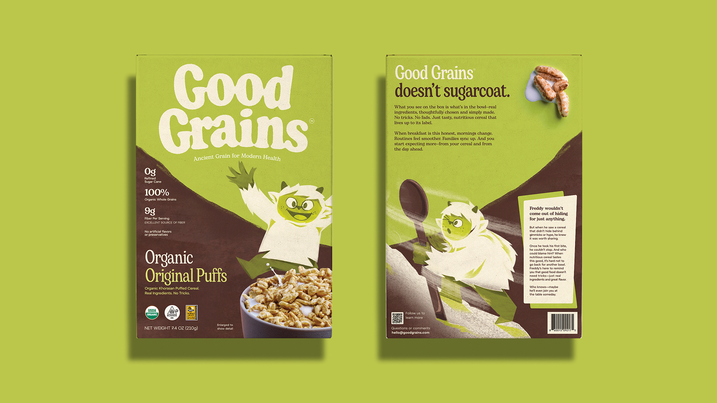
But before any of that could happen, we had to understand what we were actually building. The more we listened to the Good Grains team, the clearer it became. This was not a brand-new idea. It was a product built on a genuine conviction — that families deserve a cereal with nothing to hide. No refined sugar. No seed oils. Nothing ultra-processed. An ingredient list short enough to read in ten seconds, with every word on it understandable to a regular person.
That sounds simple. In the cereal aisle, it is almost radical.
The category had spent decades training parents to be suspicious. "Better for you" had become a phrase so overused it had lost all meaning. Brands promised clean ingredients and buried the details in small type, behind bright colors and entertainment partnerships that distracted from what was actually inside the box. Parents noticed. My family noticed. And many of us simply stopped trusting the aisle altogether.
What Cory was offering was something different. A product that mom and dad could actually hand to their kids without negotiating with the label first.
The real design problem
So that became the design problem. Not how to make the packaging look appealing — that part is expected. The harder question was how to make it feel honest. How to make the message land with an audience that had been misled too many times. That is a different kind of brief. And a more interesting one to solve.
This is where a packaging design agency in Los Angeles earns its fee, or doesn't. The visual language has to do real work. Every color choice, every typographic decision, every character on the box is either building trust or quietly undermining it. There is no neutral. A brand that claims transparency but packages itself like it has something to prove defeats itself before the product ever reaches a shelf.
What we built for Good Grains had to feel warm without feeling childish, clean without feeling clinical, and joyful without masking what the product actually was. That tension is not resolved through a mood board. It gets resolved through very specific strategic decisions made early, held consistently, and pressure-tested against the promise the founder started with.
What happened at the show
The first day of Expo West, the booth was filled with buyers. Real orders from the best retailers in the country. We heard things like "this tastes like the cereal I loved as a kid" and "I've been waiting for something like this." When you hear that, you understand exactly what the category has been missing for a long time.
I loved what the team built. But standing there, I knew what people were really responding to. Not the packaging. The fact that the product meant what it said. That is what so many brands in this space never figure out. And what Cory got right from the beginning. We just helped him say it with a lovable Yeti.
What this kind of project actually requires
A timeline like Good Grains demands something most agencies aren't set up to offer: a small team that stays on the work from strategy through final production, without handoffs and without the lag that comes from managing layers of approvals. The speed was only possible because the strategic foundation was locked early. Once we knew what the brand stood for and who it was talking to, every subsequent decision had a clear answer.
That is not unique to fast timelines. It is the same discipline that separates brands that perform at shelf from brands that look fine in a presentation and disappear within a year.
If you're building something in food or beverage and you want packaging that does more than look the part, let's talk or reach out directly at pato@gelcomm.com.
FAQ
How long does a packaging design project typically take? It depends on scope, but most of our projects run three to six months from strategy through production-ready files. Good Grains was an exception — four months for a full brand system across five SKUs — and it required very fast decision-making on both sides. The timeline is workable when the founder has a clear point of view and the team doesn't lose time to misalignment.
Do you work with food and beverage brands at the startup stage? Often, yes. Some of our most interesting work has been with founders building something new in a category that needed to be challenged, not followed. We prefer clients who have a genuine reason for existing and are willing to do the strategic work that makes packaging meaningful rather than decorative.
What does a packaging design agency in Los Angeles offer that a remote agency doesn't? Proximity to the West Coast retail and natural food ecosystem matters more than people expect. Expo West, the buyer relationships, the concentration of innovative food brands in this region — being embedded in that gives us a perspective on what the shelf actually looks like and what buyers are responding to right now. It is not the only thing that matters, but it is not nothing either.
What if I already have a brand and just need packaging help? That is a common situation and a reasonable starting point. We will want to pressure-test the existing brand positioning before we design anything, because packaging that looks good but drifts from the brand strategy creates confusion at retail. If the foundation is solid, we work from it. If there are gaps, we flag them before we start designing.
What makes Good Grains work as a brand? The product earns the promise. That sounds obvious, but most brands fail here — the positioning and the product are not in true alignment, and consumers sense it. Cory built something that actually delivers on what the packaging communicates. Our job was to make sure the packaging communicated it clearly enough that the right people picked it up.
