What CPG Rebrands Often Get Wrong About Brand Equity
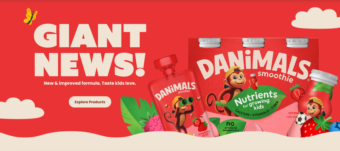
For nearly two years, our Danimals case study has been the most-viewed page in our entire portfolio at gelcomm.com, and we could never figure out why. Then Danone refreshed the brand, and I read the team's own account of the work, written by Erin Bosik, who was on it from the very beginning. Now I have a guess. Somebody was doing their homework.
I'm not neutral here, and I'll say so up front. We did a major Danimals refresh over a decade ago. So watching this new one land is part professional interest, part looking at an old photograph of yourself. Some of it I admire. Some of it I'd have fought in the room. Both reactions are useful if you're a founder or a brand manager staring down a rebrand of your own, because the Danimals refresh is a clean example of the one thing most rebrands underestimate. Equity is easy to spend and hard to buy back.
The part of a rebrand nobody budgets for
Most rebrand conversations start in the wrong place. They start with what's new. New logo, new palette, new photography, a cleaner shelf presence. All of that is visible, it's exciting, and it's what the deck sells.
The part that rarely gets its own line item is what you're giving up. Every distinctive asset you soften or retire, a color, a character, a logo quirk, a tagline, was doing work you may not have measured. Sometimes it was doing too much work, and pulling it back is exactly right. Sometimes it was the reason a tired parent found you across a crowded refrigerator case in half a second, and once you spend that, rebuilding it takes years and a media budget most brands don't have.
The skill isn't designing the new thing. Plenty of people can design a beautiful new thing. The skill is knowing which of your existing assets are load-bearing before anyone opens Illustrator. That's a strategy question, and it lives upstream of design.
What the Danimals refresh got right
Give the team real credit, because the hardest call in the whole project was the right one.
For years, Bongo the monkey did the heavy lifting for Danimals. Costumes, chaos, flavors like Cotton Candy and Birthday Cake. It worked, it built the brand, it made yogurt fun for a generation of kids. But it worked so well it started saying the wrong thing. As Erin put it, a parent could look at that cartoon monkey and reasonably assume they were holding a treat, not a snack with real nutrition behind it. Calcium, vitamin D, fiber, no high-fructose corn syrup, no colors or flavors from artificial sources, all of it quietly true, and none of it getting airtime.
So the refresh dials the monkey back and puts the spotlight on growing kids and the nutrients that support them. "Let Them Grow," confident kid photography, a clean nutritional story, and a small "No Monkey Business" checklist to make the point. The brand didn't change what it is. It finally started saying what it's been all along.
That's the good version of a rebrand. Not reinvention, clarification. The audience shifted underneath the brand, parents in 2026 read a costumed monkey differently than parents did in 1994, and the work met that shift head on. When a refresh fixes the argument a brand is making, it earns its budget.
Where a refresh gets risky
Here's where I'd have pushed back, and where the lesson gets sharper for your brand.
Erin makes a point in her own writeup that's worth sitting with. Bongo, she says, is as tied to fun as Danimals is to the color red. That's the team naming its own equity out loud. Everyone knew that red was worth something.
Which is why the move to a more muted red gives me pause. The old red was deep, and it read beautifully from across the aisle. That kind of shelf pop is exactly the asset that's hard to earn and easy to lose. I'm not sure the softer red holds the same stopping power, and stopping power is not a nice-to-have in a category where you have half a second to be seen.
The logo is the other one. Simplifying marks is everywhere right now, so common that a lot of brands are quietly starting to look like each other. The updated Danimals mark is cleaner, and it also lost some of the whimsy that made it recognizable from a distance. That whimsy was equity too. Simpler is not automatically better. Sometimes simpler is just easier to mistake for the brand sitting next to you.
None of this makes the refresh a failure. The leaf icon system is nice, the communication architecture holds together, and the strategic core is sound. It's a reminder that inside a single project you can get the argument exactly right and still spend equity you didn't need to spend.
The question to answer before you rebrand
If there's one thing to take from all of this, it's the order of operations.
Before you talk about a new look, get honest about what's actually load-bearing in your current brand. Which assets are people using to find you, recognize you, and trust you, often without knowing they're doing it. What is the brand's real job in the mind of your buyer, and which pieces of your identity are carrying that job. That diagnosis is positioning work, and it's the thing that tells you what to protect, what to dial back, and what you're free to reinvent.
Skip that step and a rebrand becomes a matter of taste, and taste is where good money gets spent erasing hard-won equity. Do that step first and every design decision downstream has something to answer to.
We tend to spend most of our time with clients on exactly this part, the upstream read, before a single visual gets made. Not because the design doesn't matter, it matters enormously, but because the design is only ever as good as the strategy telling it what not to touch.
A few questions we hear a lot
Is there a difference between a brand refresh and a rebrand? Often, yes, though people use the words loosely. A refresh usually clarifies and modernizes while keeping your core equity intact. A rebrand implies a deeper change to positioning, name, or identity. The Danimals work is a refresh, it sharpened the message without walking away from the brand. Knowing which one you actually need is half the battle, and the answer is usually more conservative than the excitement in the room suggests.
How do we know if our brand needs work at all? A useful signal is a gap between what your product delivers and what your packaging says out loud. Danimals had real nutrition it wasn't getting credit for. If your buyers consistently misunderstand what you are, that's a messaging and positioning problem worth solving, and it may not require touching your logo at all.
How do you modernize packaging without losing recognition? Start by identifying your distinctive assets, the specific colors, shapes, characters, and marks that let people find you fast, then treat those as constraints rather than options. You can update a great deal around them. The mistake is treating everything as up for grabs, which is how brands accidentally redesign themselves into invisibility.
Should we simplify our logo? Perhaps, if complexity is genuinely hurting legibility or reproduction. But simplification has become a reflex, and a lot of simplified logos are now harder to tell apart, not easier. If your mark is distinctive and people already recognize it, that distinctiveness is usually worth more than polish.
When is the right time to rebrand? Typically when your audience has shifted, when your positioning no longer matches where the market is, or when your identity is actively working against how you want to be understood. A refresh driven by a real strategic reason tends to pay off. A refresh driven by boredom, or a new decision-maker's taste, tends to cost more than it returns.
If you're facing this
If you're weighing a refresh or a rebrand and you want a clear-eyed read on what's load-bearing before you spend a dollar on design, that's the kind of conversation we like. No pitch, just a useful perspective.
You can reach me at pato@gelcomm.com, or grab time at https://calendly.com/pato-1/let-s-gel.
Thanks to Erin Bosik for the insider view on the Danimals refresh.
