neat: the "hipster x" logo

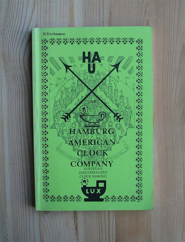
If there’s one thing you learn as a neatseeker, it’s that neatness can come in any form and from any direction. Sure, classic neatness is undeniable—it parades itself before your senses, proudly peacocking its way past the alrights and the pretty cools and all but shouting “I’m neat! I’m neat!” until you take notice or move on with your square life. Sometimes, though, neatness is a more elusive creature, hiding behind the veneer of the thoroughly un-neat, like a gold nugget inside a rock wall or a pearl inside an oyster (sorry, oysters).This week’s nugget is a conceptual critter, and it lives inside one of the most painfully trite elements of today’s branding landscape—the “hipster X”. You’ve seen them adorning everything from your local coffee shop to your local children’s brunch; there’s even a site dedicated to skewering the little guy. And, if you’re being really honest with yourself, you may have also noticed that despite countless bonehead applications, most of these four-quadrant phone-ins tend to look pretty nice. As it turns out, that could be because our tired friend has a much more noble pedigree than you might expect.Dig just beneath the surface and you’ll find many sources pointing to the New York Hard Core scene of the late 80s as the genesis of the logo’s modern edge. Local musicians took what was initially just something a bouncer would draw on the hands of underage show-goers and elevated it to a unifying mark to stake their claim on the New York music scene. Think it stops there? Think again, neat freaks!Dig a little further and you’ll hit the mother lode—a history of elevation-through-the-X since the dawn of logos as we know them. It seems that everyone from clock makers to cloth weavers saw the format as a way to give their brand an extra touch of royal legitimacy.But, of course, its royal subtext wouldn’t have taken hold without royal roots, so our excavation now takes us back to the coat of arms of the medieval era where we find that knights and kings didn’t usually call this shape a “hipster X” but instead a “saltire,” one of the 8 common divisions of heraldry they’d fly over their kingdoms and armies. These royals didn’t just hire a graphic designer to mock up some killer new flag ideas, though. Instead the saltire borrows some gravitas from the most central element of medieval life: Christianity.It goes without saying that the cross is essential to Christianity, but our dear saltire traces its lineage all the way back to the Chi-Rho. The superimposed “XP” monogram references the first two letters of the Greek word for Christ and is, in fact, the earliest known Christian symbol, even cropping up in the Roman Catacombs of the 2nd century. Surely, that must be where our story begins, right? Fat chance.From here we plunge into the abyss where saltires float through the annals of time like little primordial amoebas. An ancient Greek coin here, an Iranian banner there; no one really knows who used it first, but it’s possible the mark keeps company with some of the earliest human symbols.So, next time you pass your neighborhood microbrewery and café, give a salute. They’re just carrying the torch. Neat!1: Personal Branding 2. New York Hard Core Posters 3. Corvette Logo 4. Hamburg American Clock Company Materials 5. 18th Century Swedish Coin 6. Roman Chi Rho 7. 19th Century Textile Maker's Mark 8. Kildare Coat Of Arms 9. 1950s Pin 10. Ancient Greek CoinSuggested soundtrack for this trend.
