CPG Rebranding: What Magic Spoon's Refresh Gained, and What It Lost
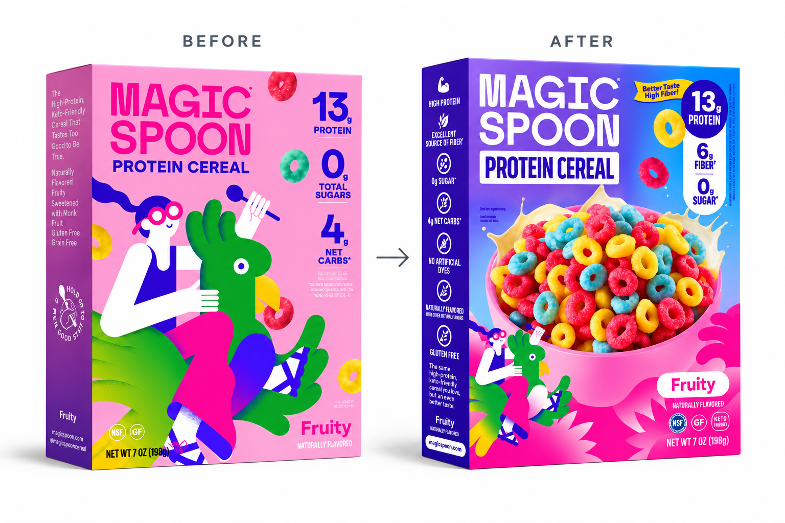
Most CPG rebrands get judged on clarity. Is the logo bigger? Are the claims easier to read? Can the shopper see the product? Those are fair questions. But in my experience they are rarely the most important ones.
The harder question is what a brand gives up to get that clarity. Magic Spoon's recent packaging refresh is a useful example, partly because it is so well designed. It gained a lot. I am less sure about what it may have lost.
What Magic Spoon had at launch
Magic Spoon launched in 2019 as a direct-to-consumer brand, selling high-protein, low-carb cereal at roughly ten dollars a box, mostly through podcasts and YouTube.
And it stood apart. Its strange, almost surreal characters and bold color made the box recognizable from across the aisle. The front panel did not lead with a bowl of cereal or a conventional product shot. It gave us a weird character, a distinctive color, and the functional facts that mattered.
The characters did not replace the nutrition claims. They changed what those claims meant. In a category where many brands can promise protein, low sugar, or fewer carbs, Magic Spoon made those benefits feel less like a health-food pitch and more like an invitation back to something people loved.
What the refresh gained
I want to be careful with this critique. None of us outside the company has seen the brief or the sales data, and Hart Brands, the agency behind the work, is one of the best in our community. There are probably very good reasons for the change.
Some of those reasons are public. As Magic Spoon grew into oatmeal, granola, toaster pastries and bars, the identity became disjointed, and the agency's goal was one cohesive portfolio. They say they kept the logo, the gradient and the characters, but gave each a clearer role. The brand is also moving deeper into retail, including Target, where a box has to win the pick-up on its own, without a podcast host vouching for it.
That is a real problem, and the new packaging solves much of it. It is well designed. The logo is larger, the functional facts are clearer, and the product is more immediately visible.
What it may have lost
The most recognizable asset, the abstract characters, is now a secondary read. Love them or hate them, they drew the customer in from afar.
Magic Spoon once felt mysterious. It broke the mold. No product image. No obvious explanation of what was inside. Just a weird character, a standout color, and functional facts presented in a way the brand seemed to own.
Now there is a huge bowl of cereal, maxed out in color, with a small character in the corner. If the goal was to give the characters a clearer role, I am not sure that role reads on shelf.
Loyal fans will likely keep buying their favorite flavors. My question is about the shopper who does not yet know Magic Spoon. Will this new design still make them stop and look, or will they keep walking toward the next functional cereal on the shelf, many of which also lead with a big bowl?
The question to answer before any CPG rebrand
Here is where I think many rebrands go sideways, and it is rarely a design problem. It is a sequencing problem.
A refresh typically starts with what is broken: the line looks inconsistent, the claims are hard to read, the logo gets lost. Those are real issues. But fixing them first, before you know exactly what shoppers recognize and why, is how brands end up with cleaner packaging that says less.
The upstream work is positioning. What does this brand mean to the people who already buy it? Which assets carry that meaning, and which are simply habit? A color, a character, a shape, a tone of voice. Some of these are doing quiet, heavy lifting. Others can go without anyone noticing.
Characters are a good example. I read the concern that an illustration system becomes hard to scale across a growing line, and that may well be true. My own roots are in entertainment licensing, and I have seen the other side of it too. Characters scale when they are treated as a system, with defined personalities, roles and rules, rather than as decoration that gets redrawn for each new box. Kellogg's understood that for generations: its characters helped make cereal brands part of family life, not just another box on the shelf.
So the problem may not have been the characters. It may have been the system around them.
How to evolve without erasing
If you are weighing a refresh, these are the questions I would want answered before anyone opens a design file:
- What do your current customers recognize from across the aisle? Ask them. Don't assume it's the logo.
- Which of those assets carry meaning, and which are just familiar? A character that makes a protein claim feel fun is doing a different job than a border pattern.
- Is the problem the asset, or the system around it? Inconsistency often comes from missing rules, not from the asset itself.
- What does a shopper who has never heard of you need to see in the first few seconds? And can your most distinctive asset do that job instead of a generic product shot?
- How far can you move before loyal customers feel the brand has changed who it is?
None of these have universal answers. But a brand that answers them first tends to come out of a rebrand clearer and still recognizable.
What consistency looks like up close
Good Grains is a Gel client, so weigh my perspective accordingly. But working closely with them over the past year has made us think a lot about what customers actually look for in the cereal aisle: benefits, ingredients, a story or theme, clarity, trust, and a reason to believe a brand will remain true to what first brought them in.
Good Grains was built around that challenge. Cory Olson's vision was an organic, family-friendly puffed cereal that brings back the nostalgic flavors we loved as kids, without the highly processed ingredients and excess sugar that many parents would not accept at home. It is now the first cereal brand in America verified Non-UPF, meaning not ultra-processed, through WISEcode. A positioning they own.
By next year's Expo West, Good Grains will be in more stores nationwide than most early-stage ventures have the opportunity, or capacity, to reach. What I have observed in Cory and his team is consistency: listening to customers and having the courage to keep iterating as they learn what really matters to the people buying the product. They will evolve, but their core should remain the same. A brand families can trust to stay who they say they are.
A closing thought
Consistency matters, especially in a brand's mission and how it communicates it. Like any relationship, trust is built through consistency. A brand should grow and evolve, but how far it evolves from what people first discovered, and fell in love with, matters even more years later.
If you are thinking through a refresh and want a second set of eyes on what to keep and what to let go, I'm always happy to talk it through: pato@gelcomm.com.
Frequently asked questions
How do I know if my CPG brand needs a rebrand or just a refresh?
A refresh usually works when the positioning is still right and the execution has drifted, often after a product line grows faster than its design system. A full rebrand tends to make sense when the positioning itself no longer fits the customer or the category. Many brands that think they need the second really need the first.
What should stay the same in a packaging redesign?
Typically, the assets shoppers use to find you: a color, a character, a shape, a logo. The way to know which ones matter is to ask current customers what they recognize, rather than assuming. The assets that carry meaning are worth protecting, even if they get cleaned up.
Can a rebrand hurt sales?
It can, especially in the first months on shelf, if loyal shoppers no longer recognize the box or new shoppers see a package that looks like everything around it. A redesign that keeps its most distinctive assets usually reduces that risk.
Are brand characters worth it for a better-for-you or functional brand?
Often, yes. Functional claims like high protein or low sugar are easy for competitors to copy. A character gives those claims a personality and a story that is much harder to copy. The catch is that characters need a system, with clear roles and rules, or they get hard to manage as the line grows.
When should brand strategy come before packaging design?
Almost always before the first sketch. Design solves the problems you hand it. If positioning and an inventory of your recognizable assets come first, the design work tends to be faster, and the result is more likely to keep what customers already love.
