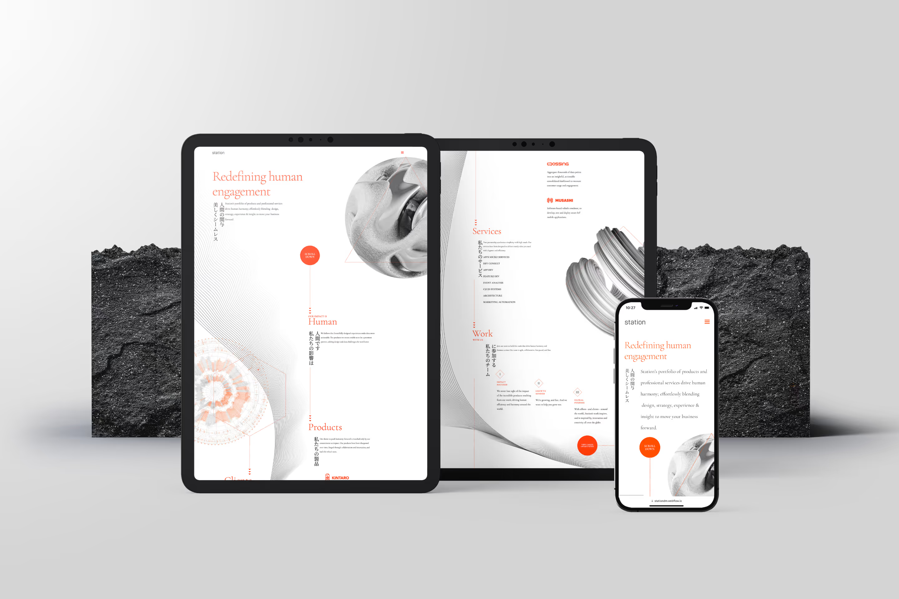
Redefining Human Engagement
Helping Station find their impact by exemplifying the “Why” beneath the “How”.

The Ask
Station Digital Media, a burgeoning American and Japanese global digital platforms developer, had found success doing white label work for top tier companies like Toyota, Kia, and Amazon. They had strong products, but were never able to showcase their work or make a name for themselves due to this white labeling.
They hoped to establish their own identity within the marketplace, and enlisted Gel to develop a brand identity and marketing tools to target the consumer products, retail, healthcare, and travel and leisure segments, where their products and service offerings would be a natural fit.
The Challenge
We found that Station’s overarching brand story, brand specialty, and their “why” was buried under the brand’s ultra-successful subparts. Station was being defined by what its products could do, which, ultimately, was preventing them from standing out and distinctively marketing themselves to new clientele.
We suggested that these products serve as support within a bolder brand identity that could more easily & efficiently tell the brand’s story. Station’s branding needed to be authentic, ownable, and compelling. Its brand story needed to speak to the hierarchy of impact: function → value → impact. Currently, it was just speaking to function.
The Solution
We determined through our brand positioning process that Station strived to harmonize technology and humanity, leading us to their “north star”; redefining human engagement. This became our guide as we began to craft their landing page and beyond, focusing on Station as proactive vanguards in their field who deliver practical results with humanity at their core.

Hierarchy of Impact
To create a strategic groundwork on which to base the landing page (and branding to follow), we established a refreshed positioning for Station–one that was was both approachable and authoritative:
Impact (Why):
Redefining Human Engagement
Value (What):
Creating Beautiful Experiences
Function (How):
With Incredible Products
This new hierarchy transformed Station’s positioning and brand identity from a functional brand built for white-label work into a unique brand that is profoundly human, sophisticated, efficient, authoritative, and impact-focused.

Disruptive Harmony
Drawing inspiration from Eastern design, we landed on a visual direction inspired by Station’s Japanese roots. This would bring an unexplored, disruptive aesthetic to the space, all while conveying the brand’s emphasis on “harmony.” Smooth animation and imagery further represented the interaction between humans and technology.


Tech Meets Humanity
In an effort to establish an unexplored visual identity across the brand’s marketing elements, we looked to vertically oriented Japanese poster art for inspiration. This helped draw the eye down the page effortlessly as the target audience was “mid-scroll”. The minimal, elegant design lent itself to conveying both the technical and human while serving as a not to Station’s Japanese roots.


