Moore to Love
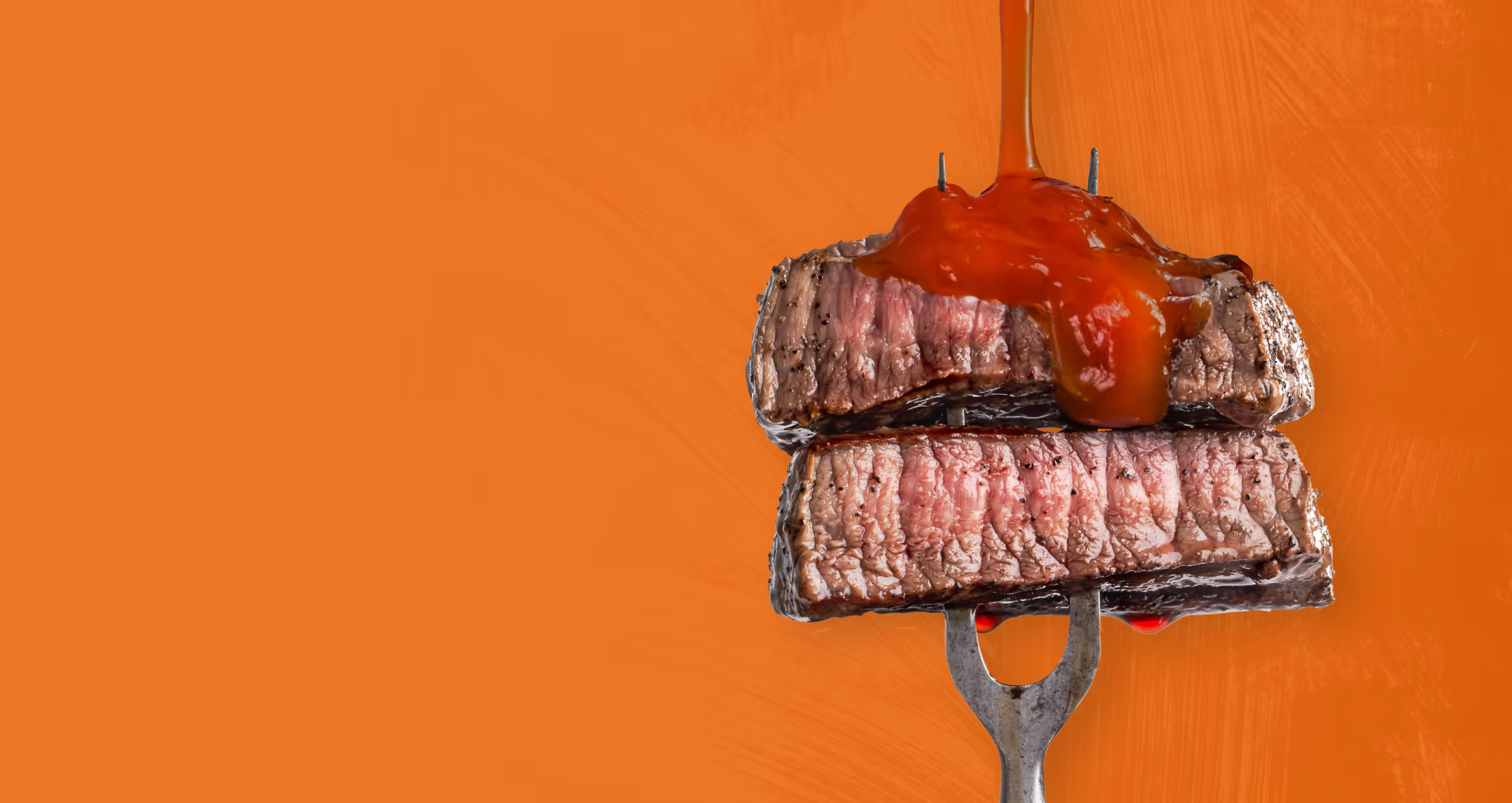
Pouring on the taste appeal to an iconically Southern staple.
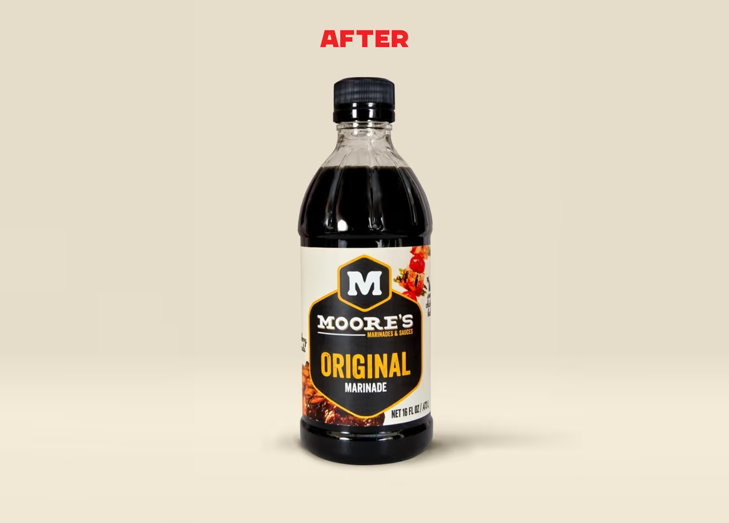
Moore's Marinade
year after refresh
year after refresh
retailer distribution
The Ask
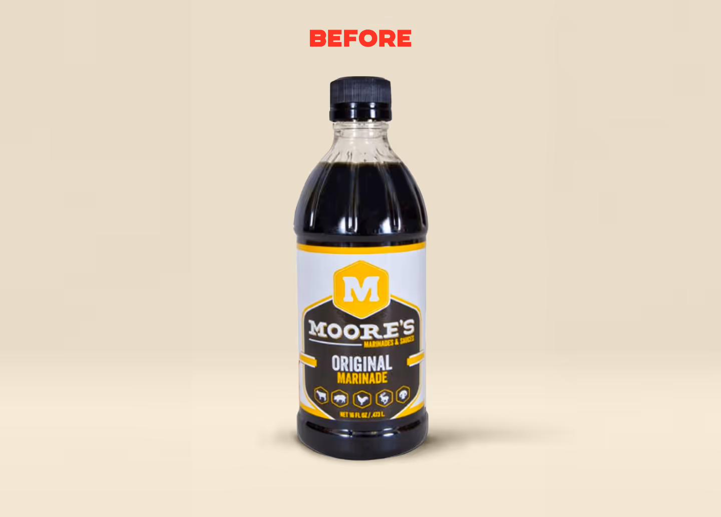
After successfully building a loyal customer base, Moore’s, a beloved Southern brand of marinades and sauces, decided to embark on a brand refresh. However, the design team's lack of understanding of the market landscape led to a dramatic update in packaging design, posing a significant challenge in reaching their well-established customers. Unfortunately, the drastic change in packaging design caused the brand to experience a double-digit decline, marking a tailspin in its otherwise successful trajectory.
The Challenge
Rather than viewing it as a “creative update”, Gel pulled back the curtains to discover what was great about the brand, and how that could be communicated more effectively. We discovered that Moore’s had been targeting the wrong customer entirely. While the company had refreshed their package and aligned their marketing efforts to appeal to the utilitarian grill master man, our testing showed that the main buyer of Moore’s was the household’s primary grocery shopper. That shopper cared much more about flavor, family, and taste appeal than the rough, tough, and reliable visual approach that was causing a tank in market sales.
The Solution
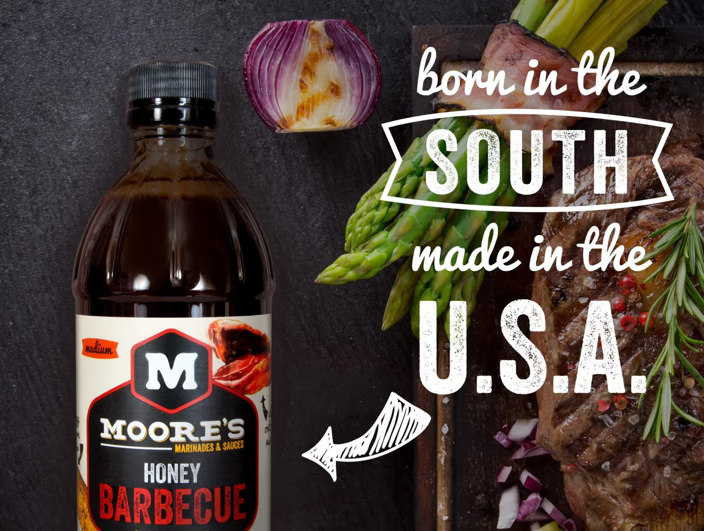
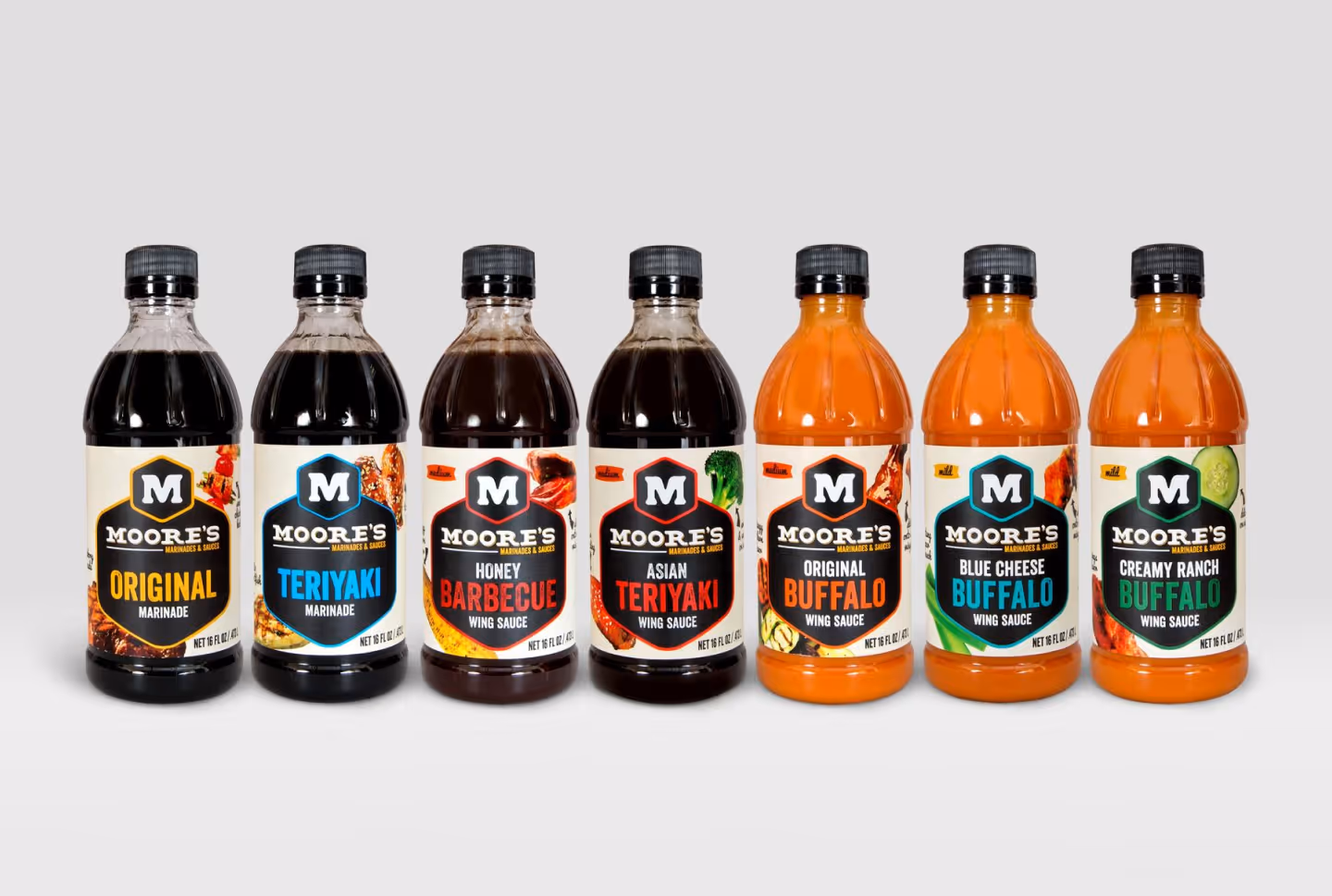
We approached this challenge by pausing to understand the key purchase drivers for the segment and assessing how to improve the new label without further disruption to the brand. Once we focused on Moore’s rich history, Southern roots, and delicious flavor to purposefully bring visual appeal back to the package. We were able to successfully re-establish the brand through additional photography and taste appeal, as well as giving the consumer something to trust again. Our brand refresh facilitated multiple new line extensions and the development of new flavors, while reverting the downward spiral the brand had been facing.
Aggressively Good
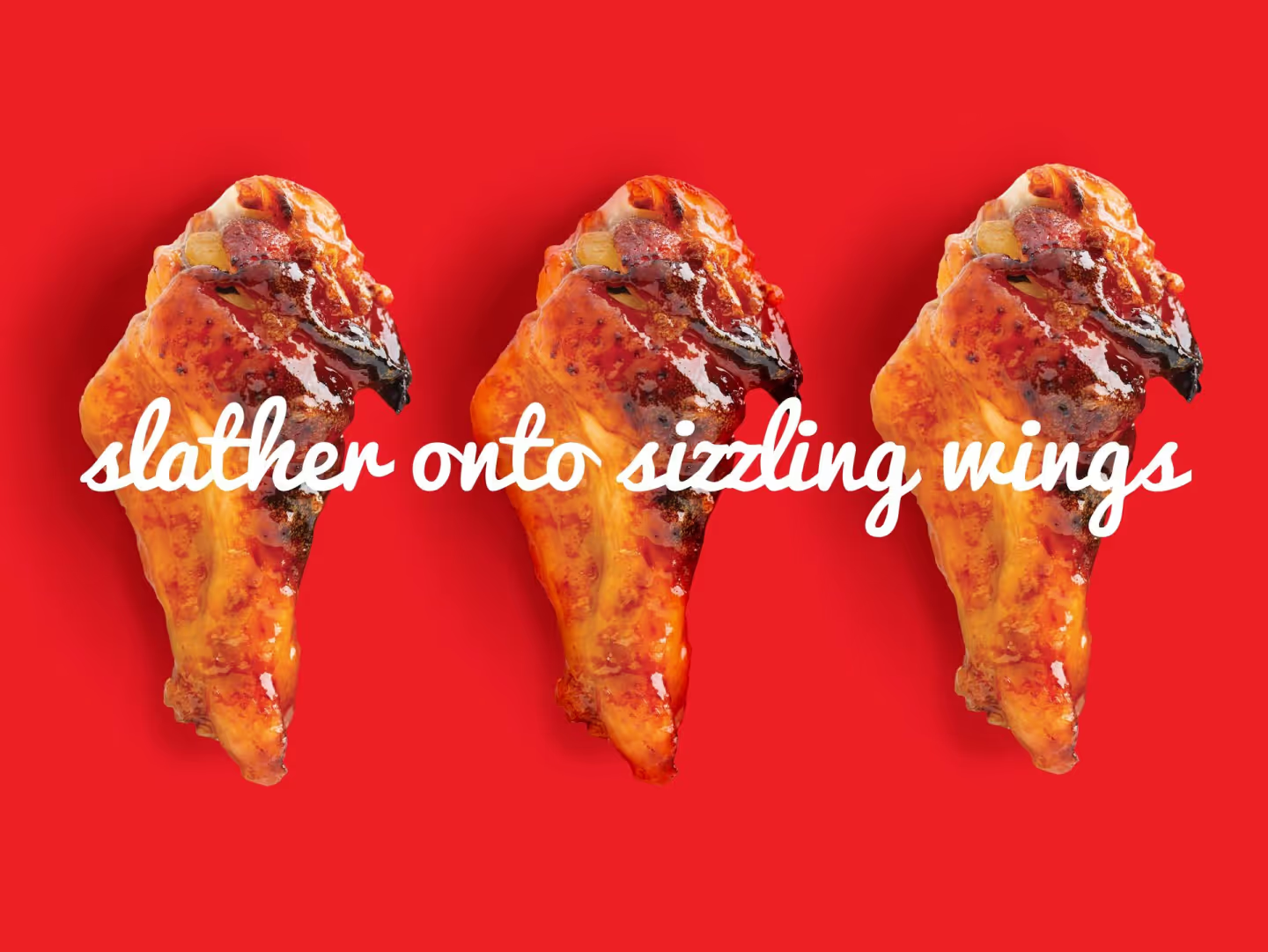
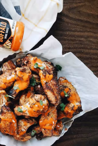
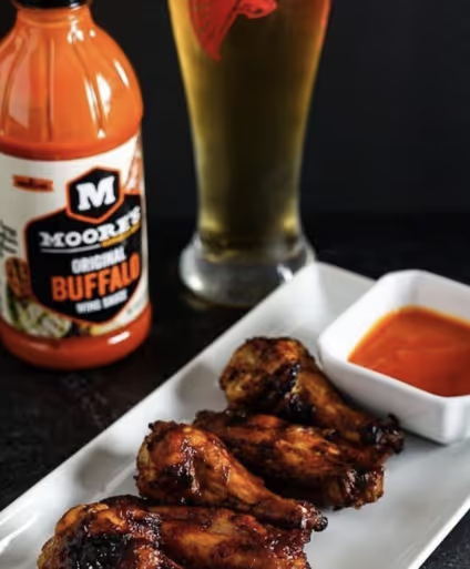
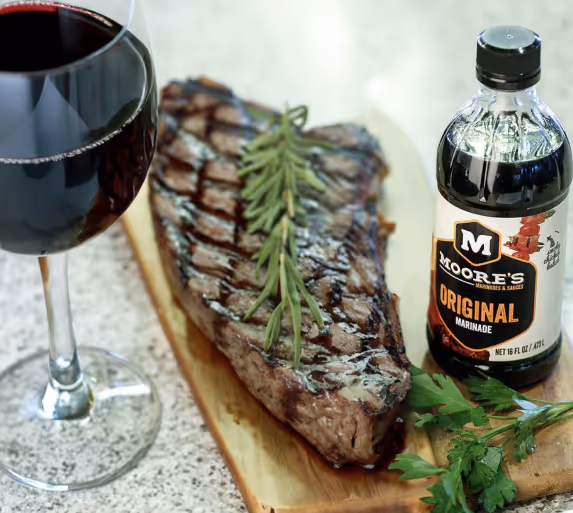
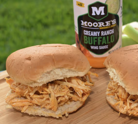
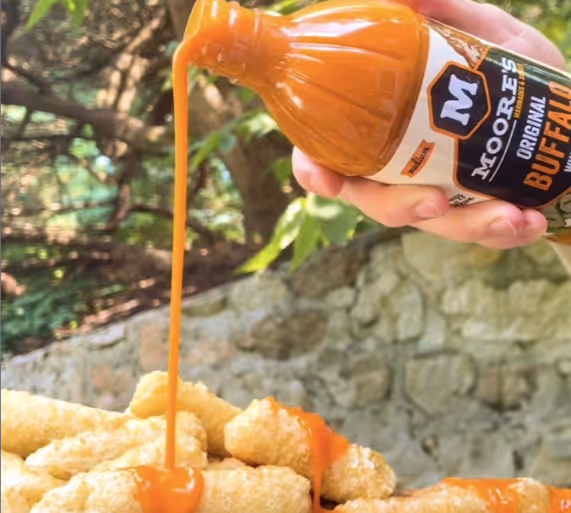
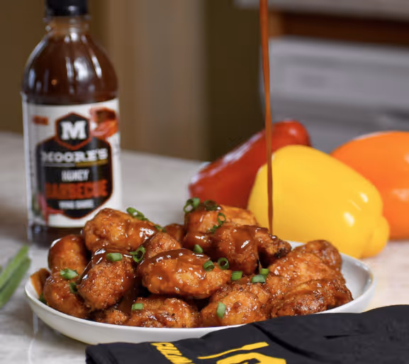
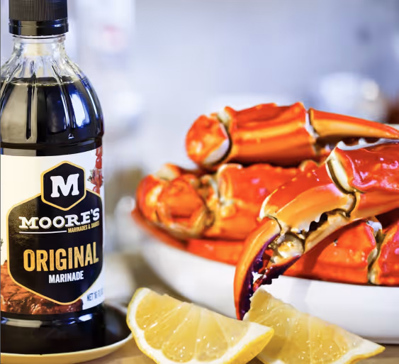
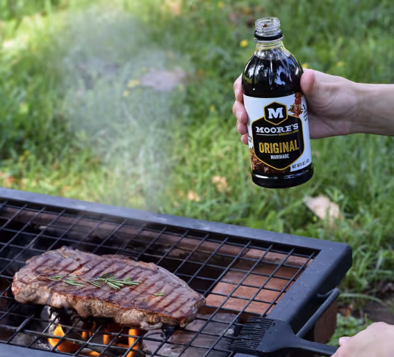
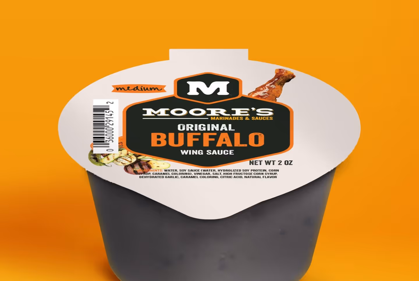
We brought our strategy to life with a brand identity that is eye-catching, modern, and brimming with personality. Mouthwatering macro-shots of the food maximize taste appeal and make a hero out of the snacks themselves, displaying pride in their products. Typography, color, and personality were all “big-ified” to match our bold new tone.
A Recipe For Sizzling Success
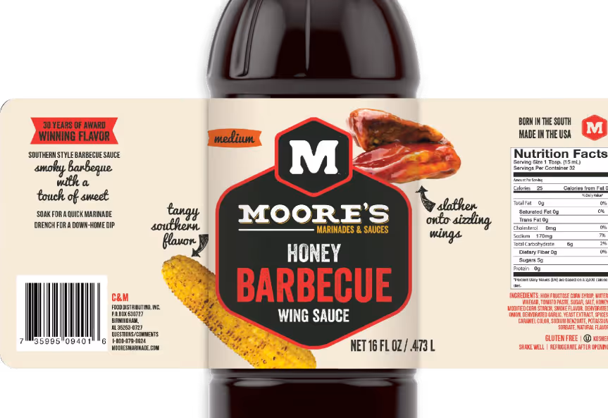
We translated what we learned about the market into actionable steps to improve Moore’s packaging, and built out a visual direction to inspire design. The pillars of Flavor, Heritage, and Ease of use were established within the design by wrapping photography fully around the label, injecting personality through mouth watering copy, and embracing Moore’s southern charm.
Tasteful Response
We brought our strategy to life with a brand identity that is eye-catching, modern, and brimming with personality. Mouthwatering macro-shots of the food maximize taste appeal and make a hero out of the snacks themselves, displaying pride in their products. Typography, color, and personality were all “big-ified” to match our bold new tone.
View More Work

Project Title
Project Title
Project Title
Project Title