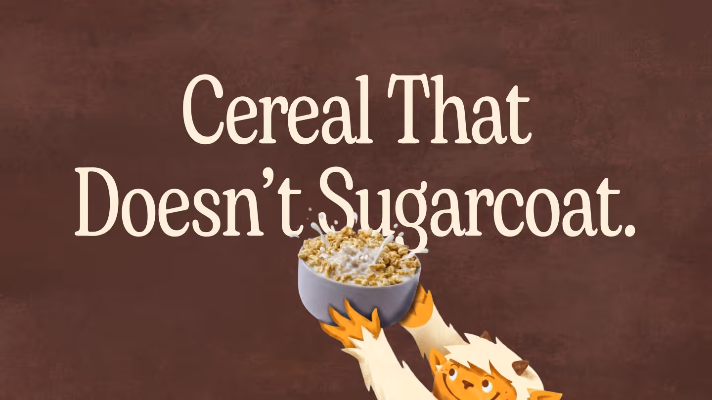
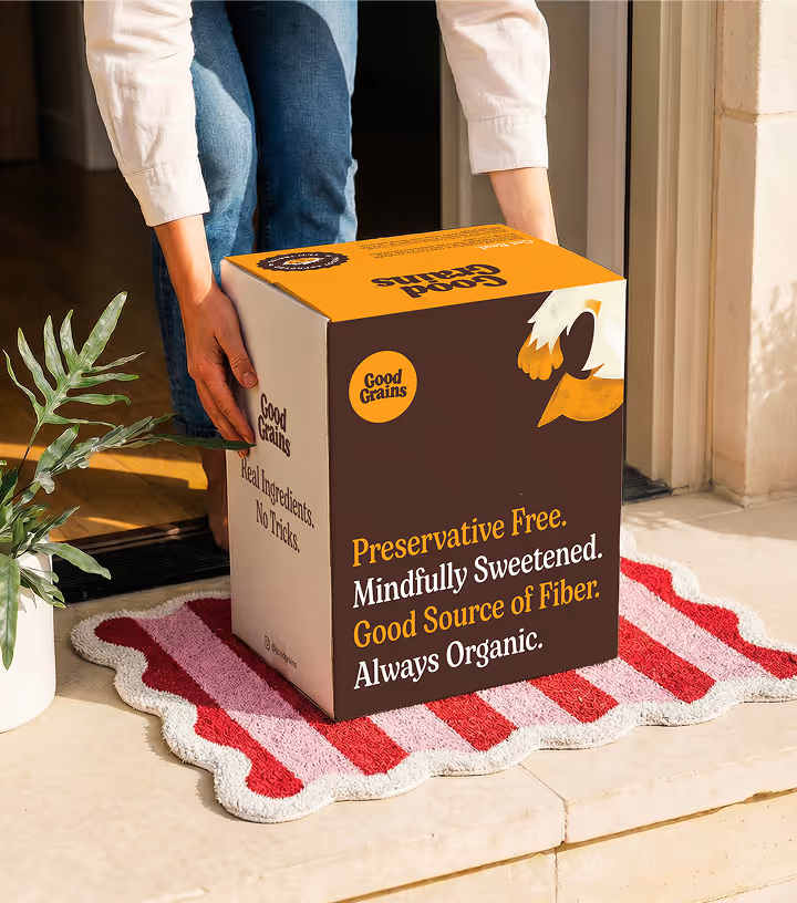
Cereal That Doesn’t Sugarcoat.
Launching organic puffed cereal made with real, thoughtfully chosen ingredients
The Ask
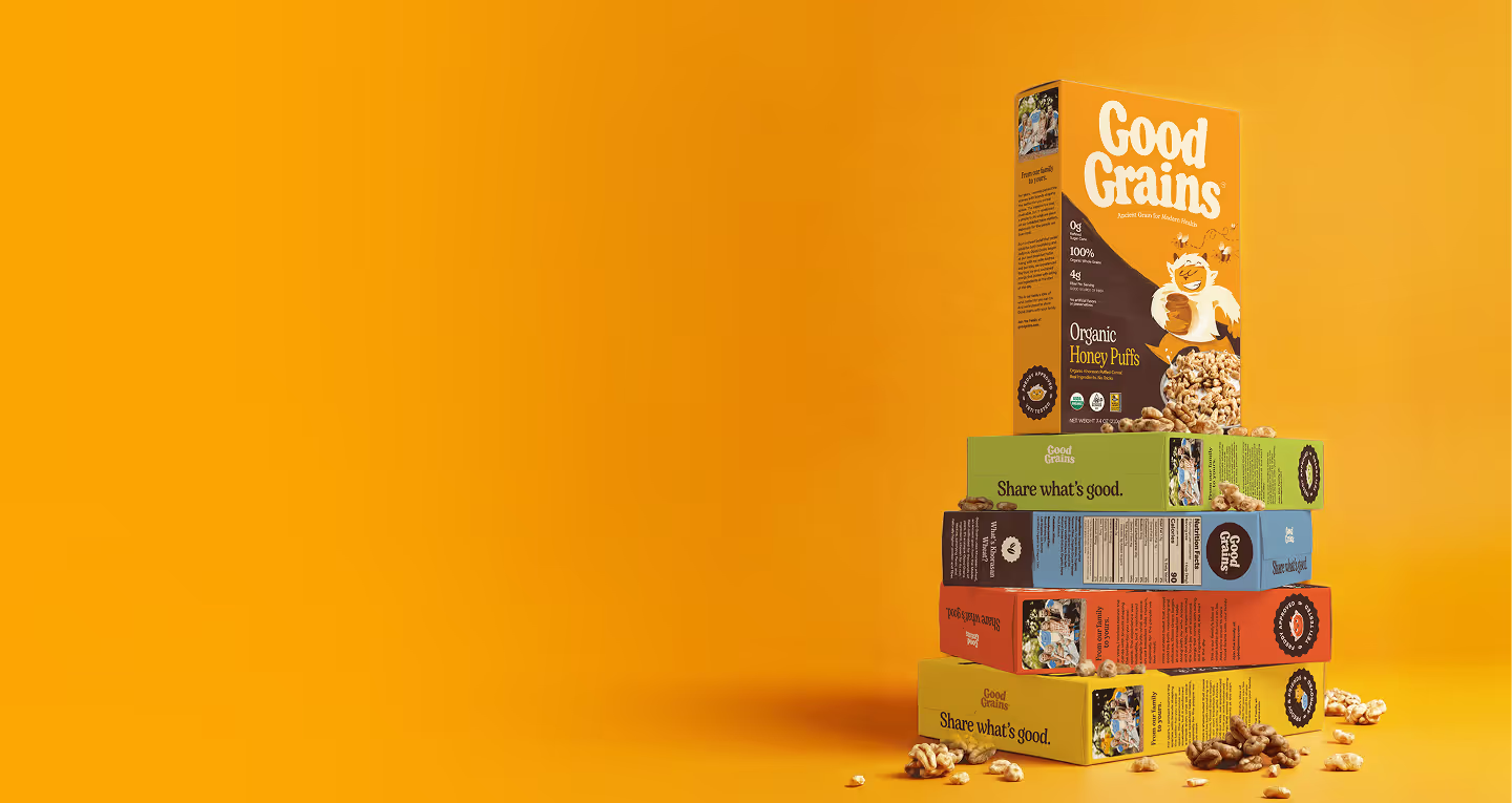
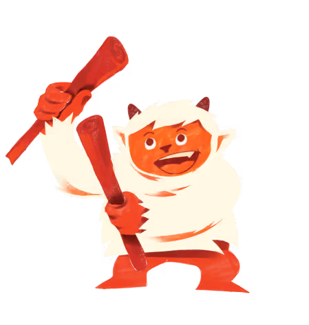
Good Grains was built around a simple belief: cereal should be made from real food, not formulas. The founder had previously attempted to launch the brand and came to us with a name already in place — along with a yeti character they wanted preserved and reimagined. With Expo West fast approaching, they needed more than a refresh. They asked for a cohesive brand strategy, identity system, and a fully built website — delivered on an accelerated timeline to relaunch the brand with impact.
The Challenge
The cereal aisle is crowded — and increasingly mistrusted. Many families have moved away from the category altogether, skeptical of over-processed ingredients and exaggerated health claims. Good Grains needed to win back the primary household buyer while still engaging kids at the table. The challenge was to create a brand that felt transparent and trustworthy to parents, joyful for children, and rooted in harmony — simple mornings and simple ingredients, shared together.
The Solution
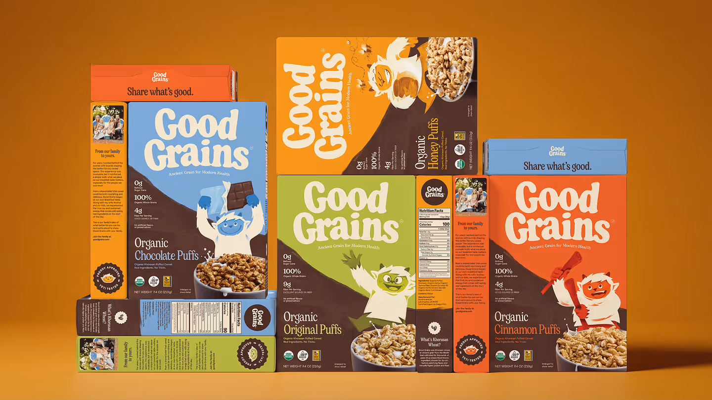
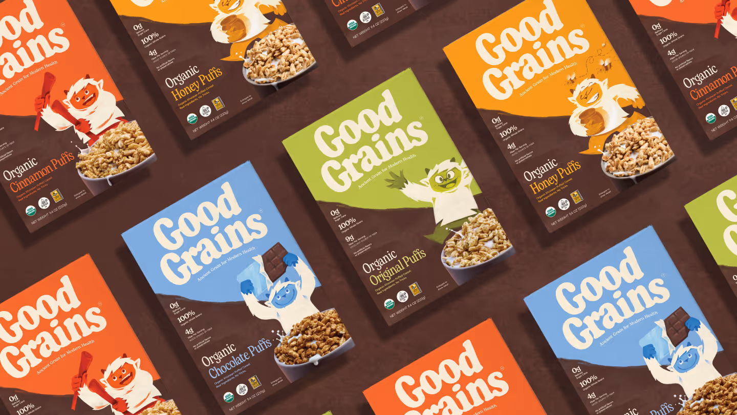
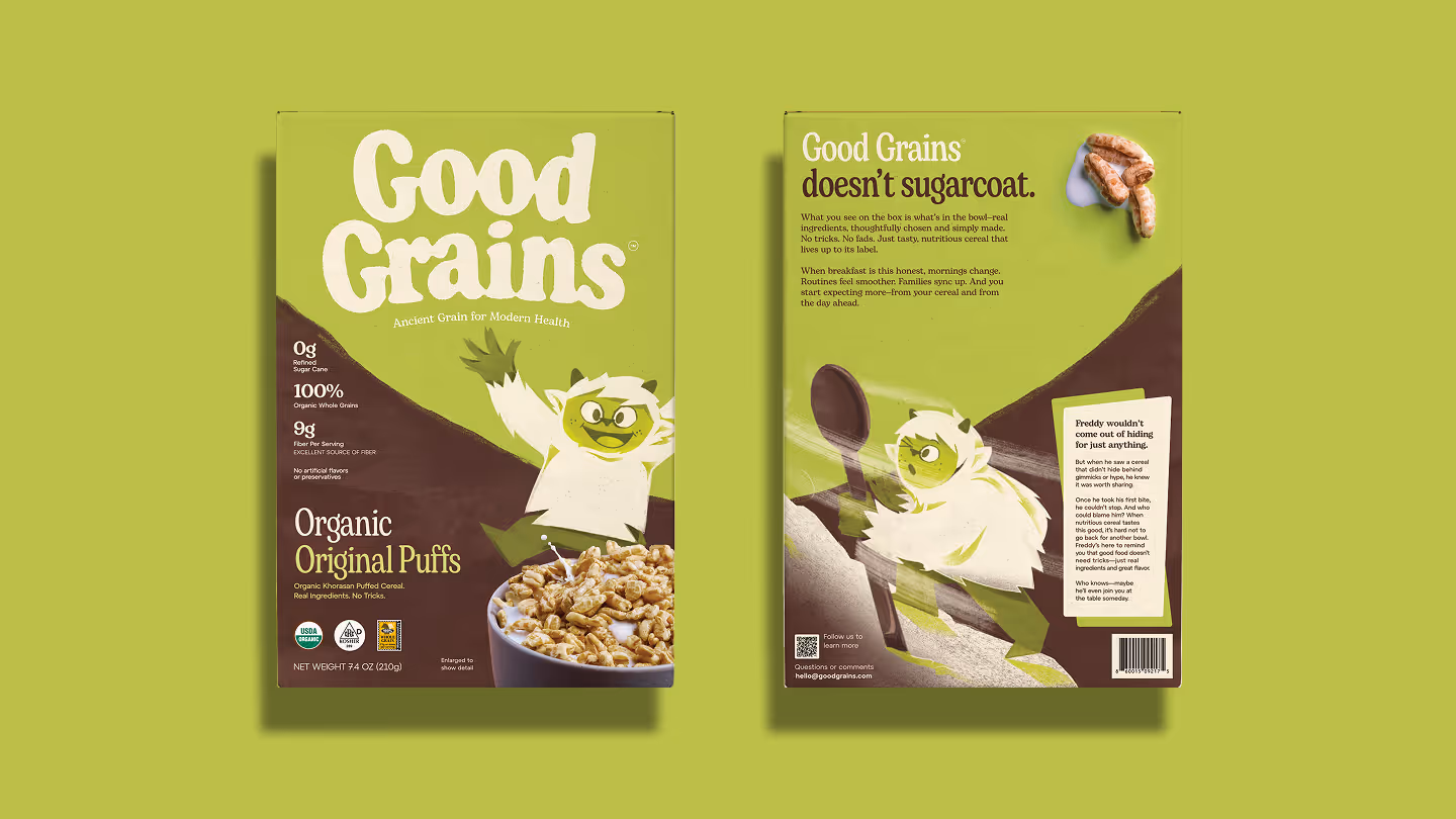
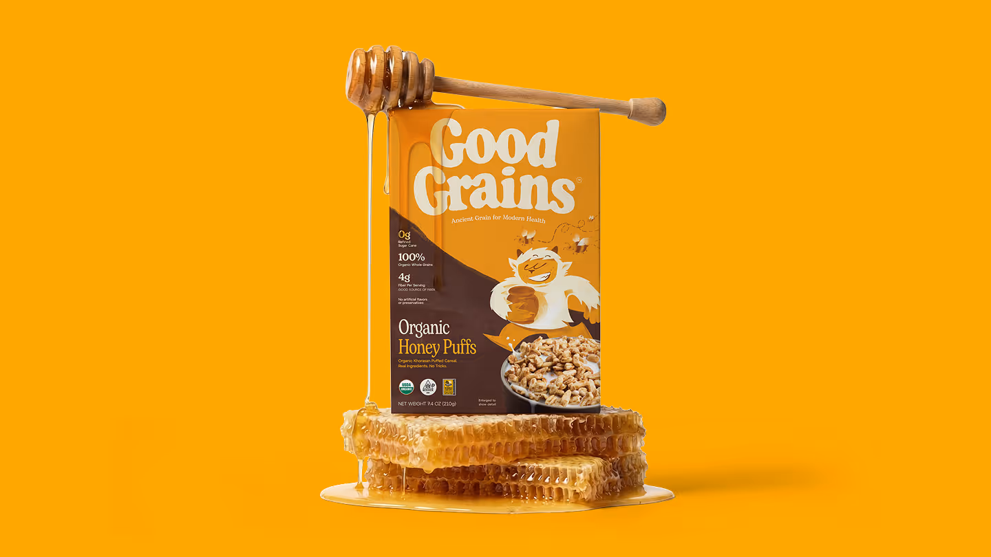
We built Good Grains around bold ingredient transparency. Instead of hiding behind claims, we made the ingredients the hero — spotlighting features like organic khorasan wheat as a true point of difference. The visual identity reinforces this honesty through a grounded, natural color palette and straightforward tone of voice. At the same time, we leaned into flavor as a celebration — chocolate, honey, and cinnamon appearing in their recognizable, organic forms on pack. The brand speaks with clarity and confidence: real ingredients, real food, real transparency. The yeti adds balance, introducing warmth, playfulness, and intrigue. Ensuring the brand resonates with both parents and children while staying true to its core promise.
The Harmony-Driven Household
According to our in-depth audience research, Good Grains’ primary consumer is the modern, mindful parent, most often millennial households, who values ingredient transparency and balanced living. They are label readers, skeptical of over-processed foods, and intentional about what enters their home. At the same time, mornings are busy.
They need convenience without compromise.
They are seeking harmony between health and taste, responsibility and ease, parent priorities and kid preferences. Good Grains exists at that intersection, and we built out every piece of the brand identity to shape those audience perceptions.
Nothing To Hide
Good Grains was motivated by seeing “better-for-you” cereals that
looked clean on the outside but told a different story on the label.
We set out to create a cereal we would feel confident serving at our
own breakfast table.
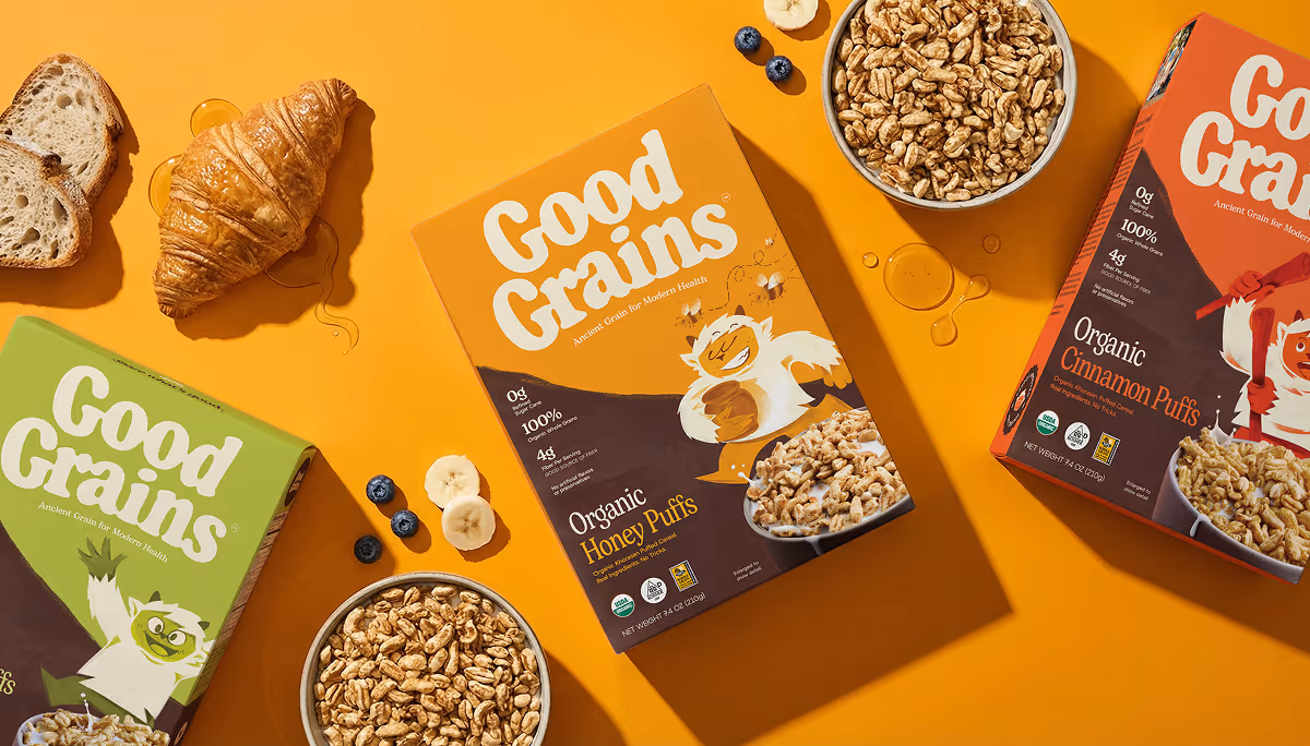
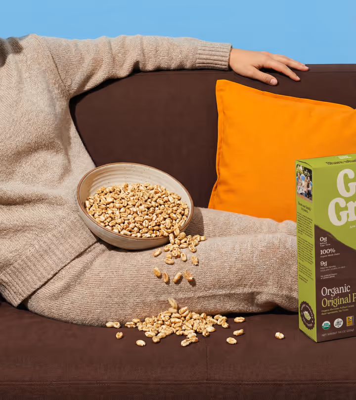
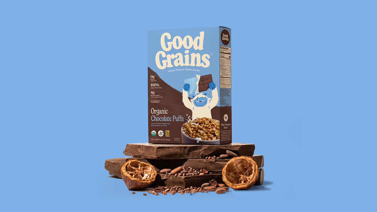
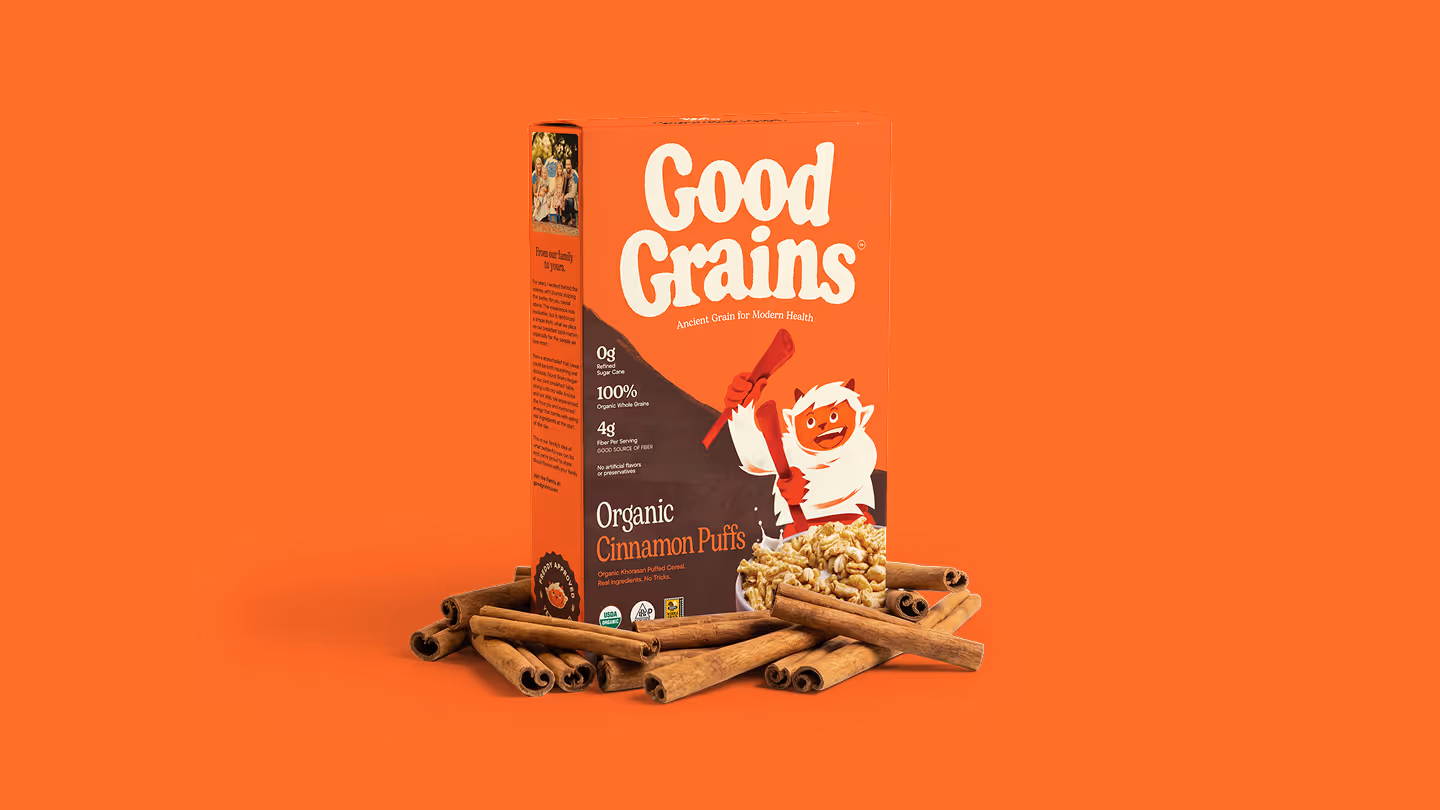
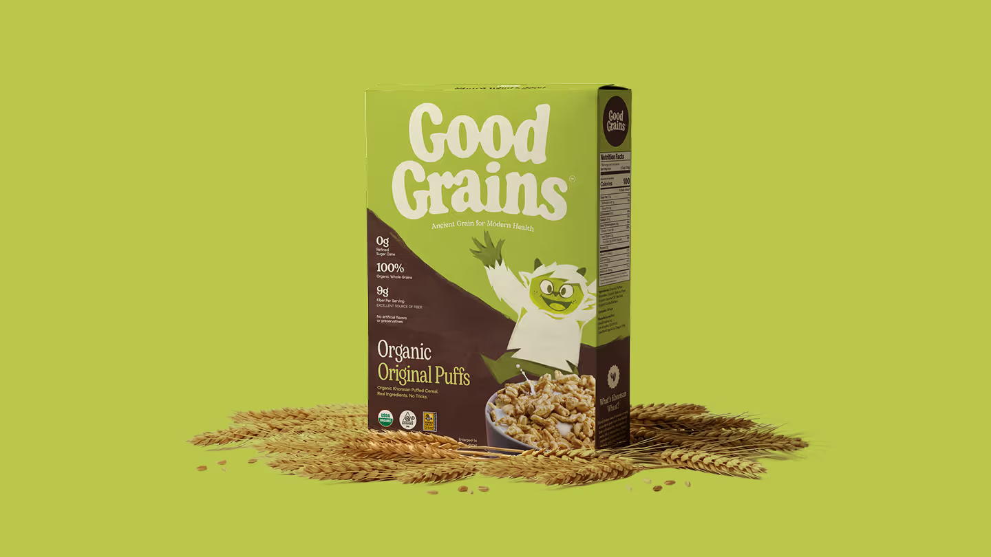
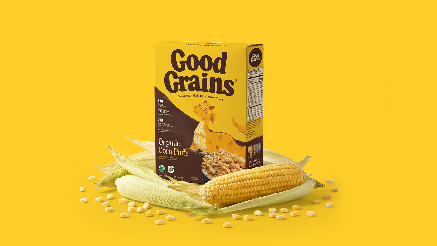
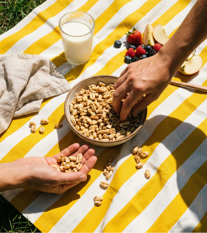
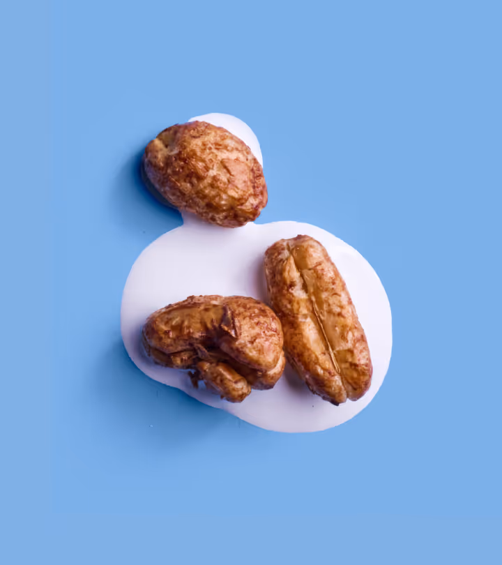
We highlighted a key point of differentiation — the ingredients. Good Grains contains Khorasan, an ancient grain untouched for thousands of years, that delivers naturally occurring protein, fiber, and rich, satisfying flavor. While our corn puffed product is made from light, simple and naturally sweet corn. The result is a cereal so uniquely nutricious and delicious that even mythological creatures can’t resist it.
The Harmony-Driven Household
According to our in-depth audience research, Good Grains’ primary consumer is the modern, mindful parent, most often millennial households, who values ingredient transparency and balanced living. They are label readers, skeptical of over-processed foods, and intentional about what enters their home. At the same time, mornings are busy.
They need convenience without compromise.
They are seeking harmony between health and taste, responsibility and ease, parent priorities and kid preferences. Good Grains exists at that intersection, and we built out every piece of the brand identity to shape those audience perceptions.
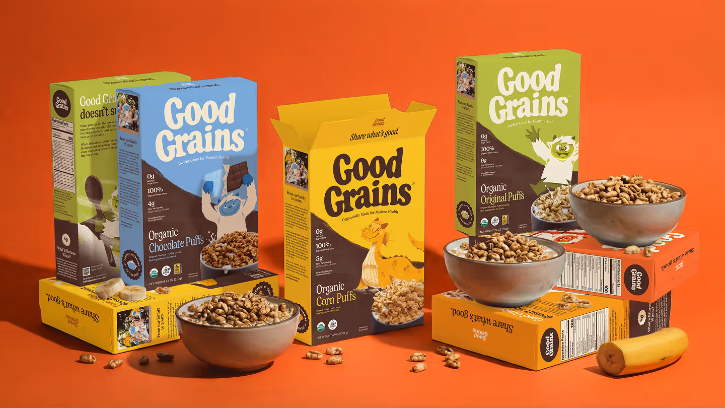
Explore The Flavor
The Chocolate, Cinnamon, and Honey flavors bring back the tastes we grew up loving, the ones that made breakfast feel like a treat. But this time, without the compromise. With zero refined sugar and just 3g of added sugar, we get the flavor we crave without the guilt. The brand and packaging we created reflect the comfort of familiar mornings, reimagined with ingredients we can actually feel good about.


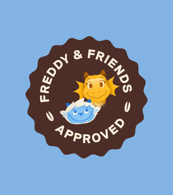

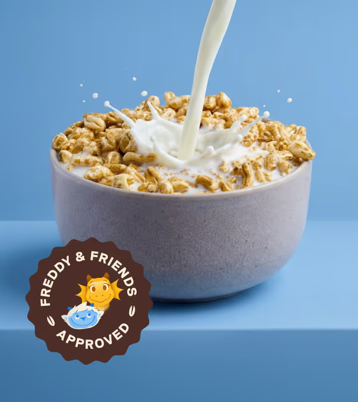
Freddy & Friends
We developed illustrated characters that were simple, friendly, and approachable, designed to feel modern rather than cartoonish. Drawing from mythological creatures like the Yeti and the Loch Ness Monster, we built a playful narrative system that supports the brand’s larger story of transparency and integrity.
The characters also connect to brand health by promoting an active, joyful lifestyle — reinforcing movement, balance, and energy. They add warmth and connection without distracting from the product itself. And this is just the beginning, more of the Good Grains world is still to come.
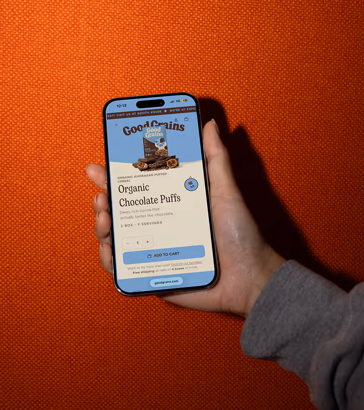
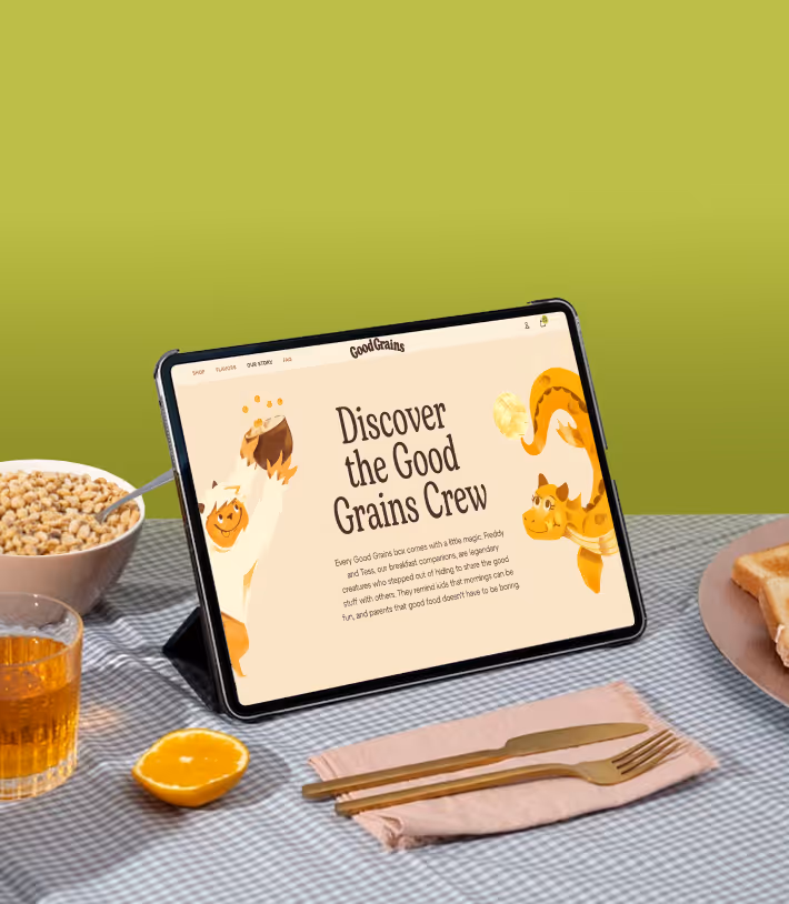
From Daily Grain to Digital Delight
Good Grains needed more than a template, they needed a digital experience capable of competing with the biggest cereal brands. We designed and built a fully custom Shopify Plus website from the ground up, including UX, visual design, development, and AI-assisted imagery. Despite an aggressive two-month timeline leading up to Expo West, the result is a bold, polished e-commerce experience that feels like a natural extension of the brand.
A dynamic color system allows the site to shift with each product flavor, while a fluid responsive design ensures the experience adapts beautifully across all screen sizes. Built with clean code, accessibility, performance, and SEO best practices, the site is designed to scale as the brand grows.
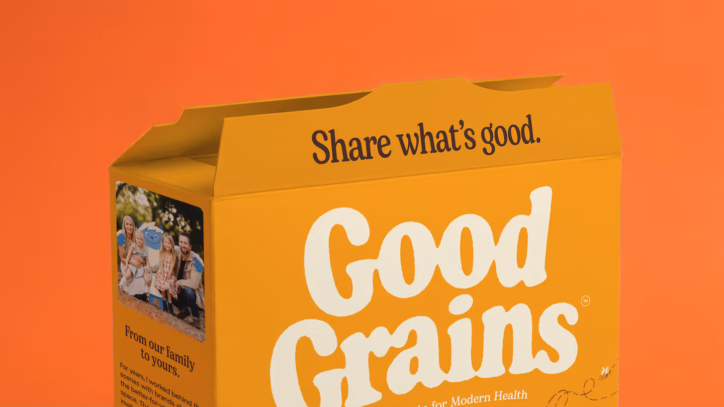
Share What’s Good
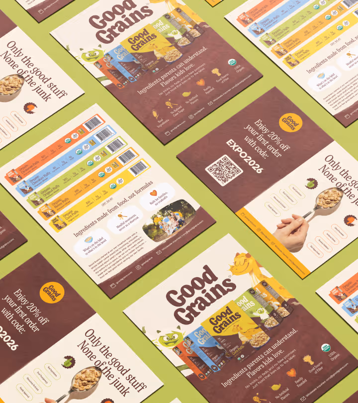
Beyond the core brand system, we developed a full suite of supporting materials to bring Good Grains to life across touchpoints. This included social content and templates, art-directed photography, business cards, and sales sheets for retail conversations. We also designed the Expo West booth experience, ensuring the brand translated seamlessly from screen to shelf to in-person launch.
View More Work

Project Title
Project Title
Project Title
Project Title