Furry, Friendly, Monsters
Taking the scaries out of building a children’s monster brand
The Ask
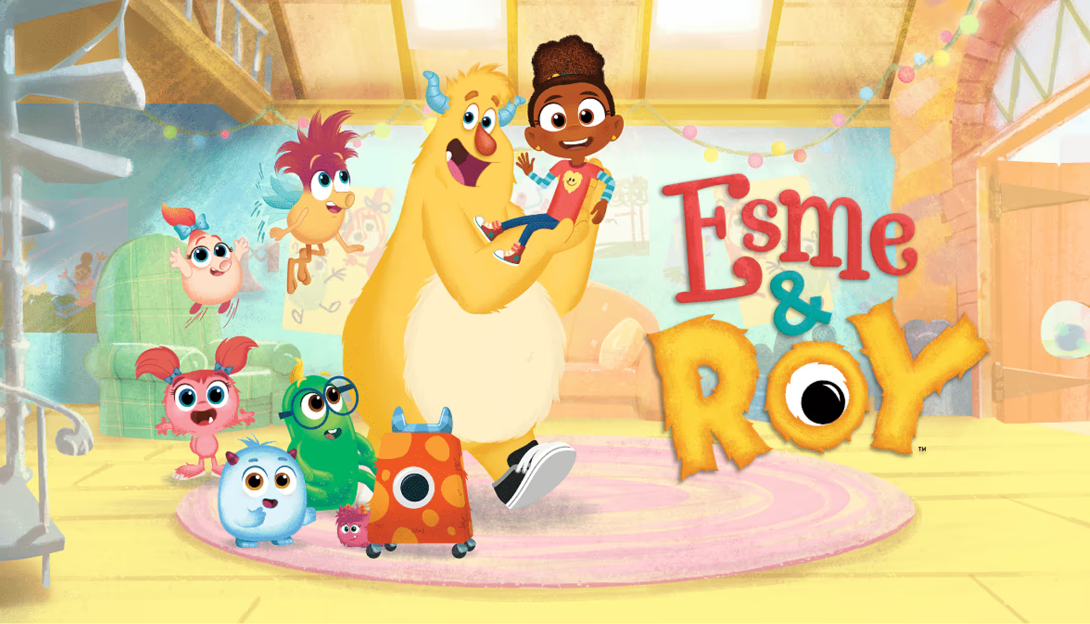
Sesame Workshop debuted their first new animated series in over a decade, Esme & Roy, and needed a complete packaging and graphics style guide built to bring its warmth and emotional intelligence to retail.
The Challenge
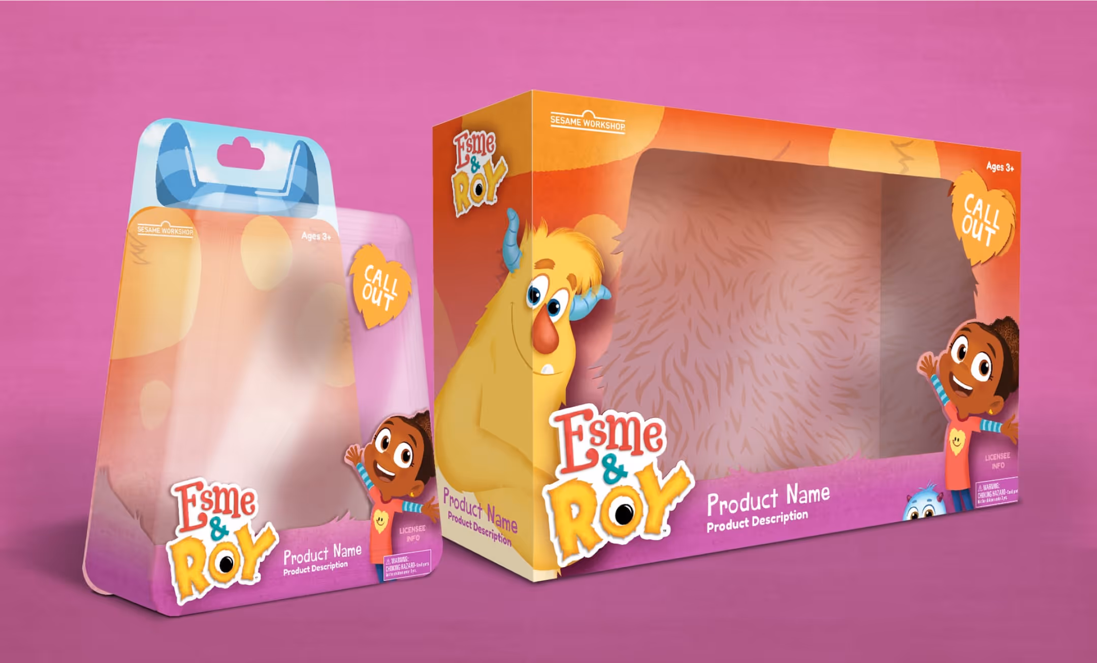
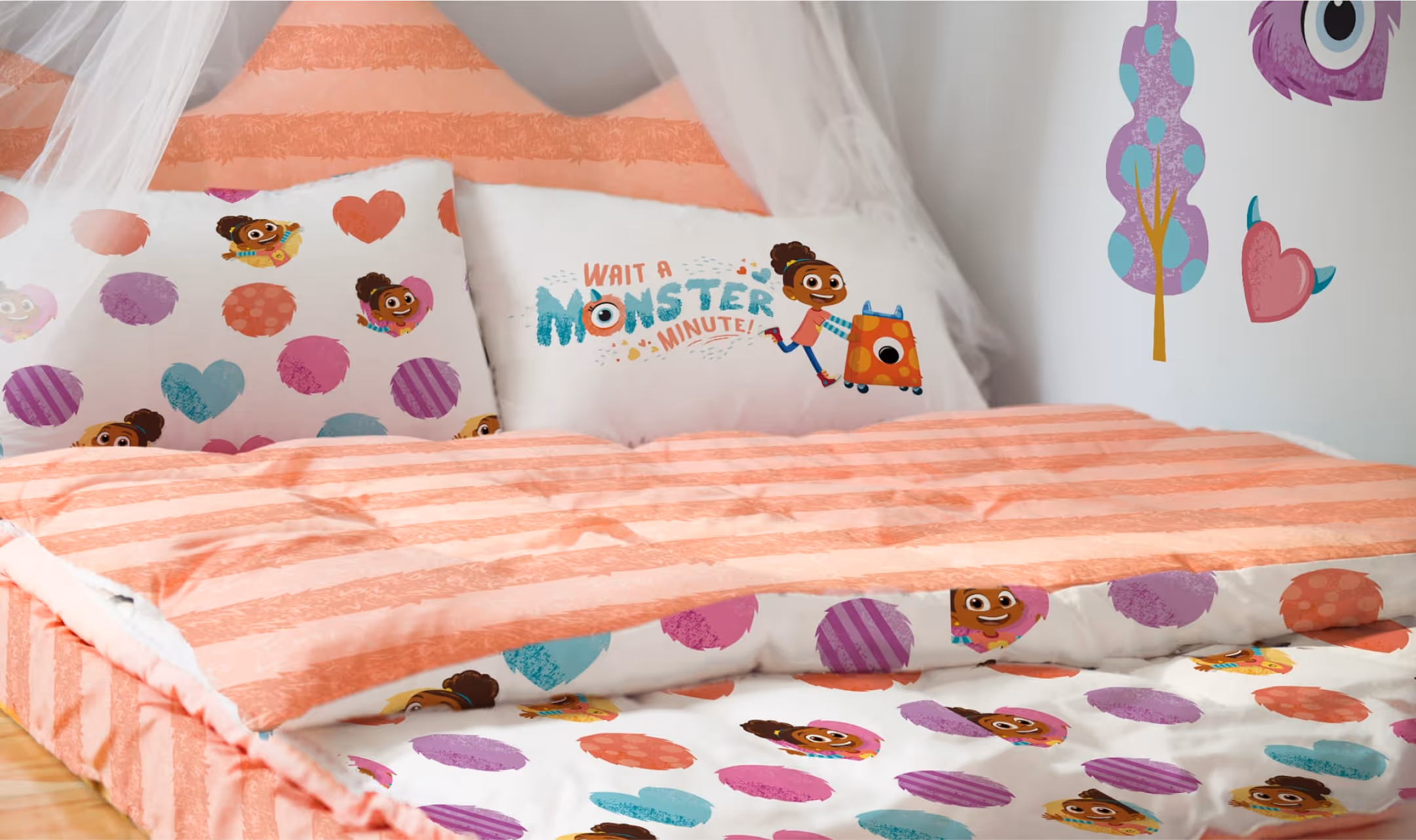
Translating the furry, friendly world of Esme & Roy to softlines, hardlines and packaging brought together our illustrators, graphic designers, and packaging engineers. We played with colors, textures, shapes and forms that would be engaging to today's preschoolers, translating the quality of the show's tactile animation to vector graphics and illustration for ease of use across products.
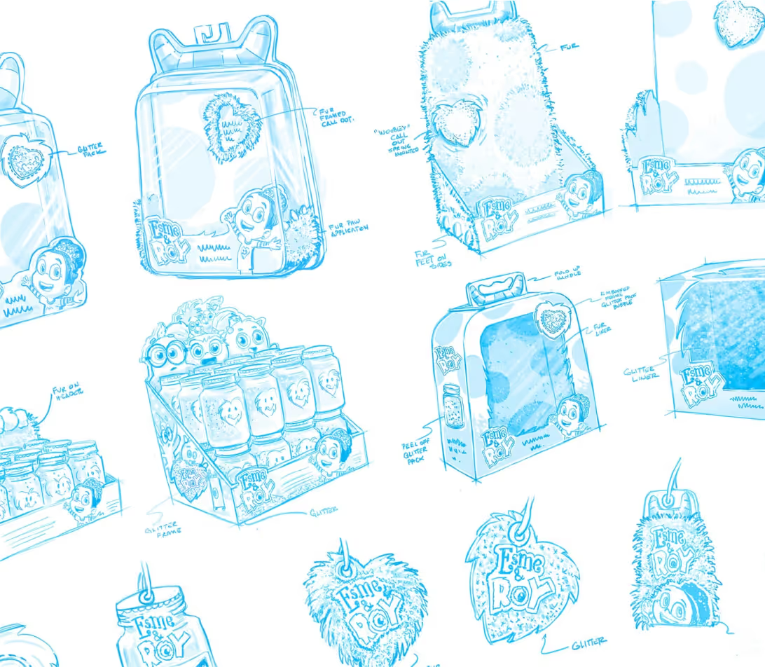
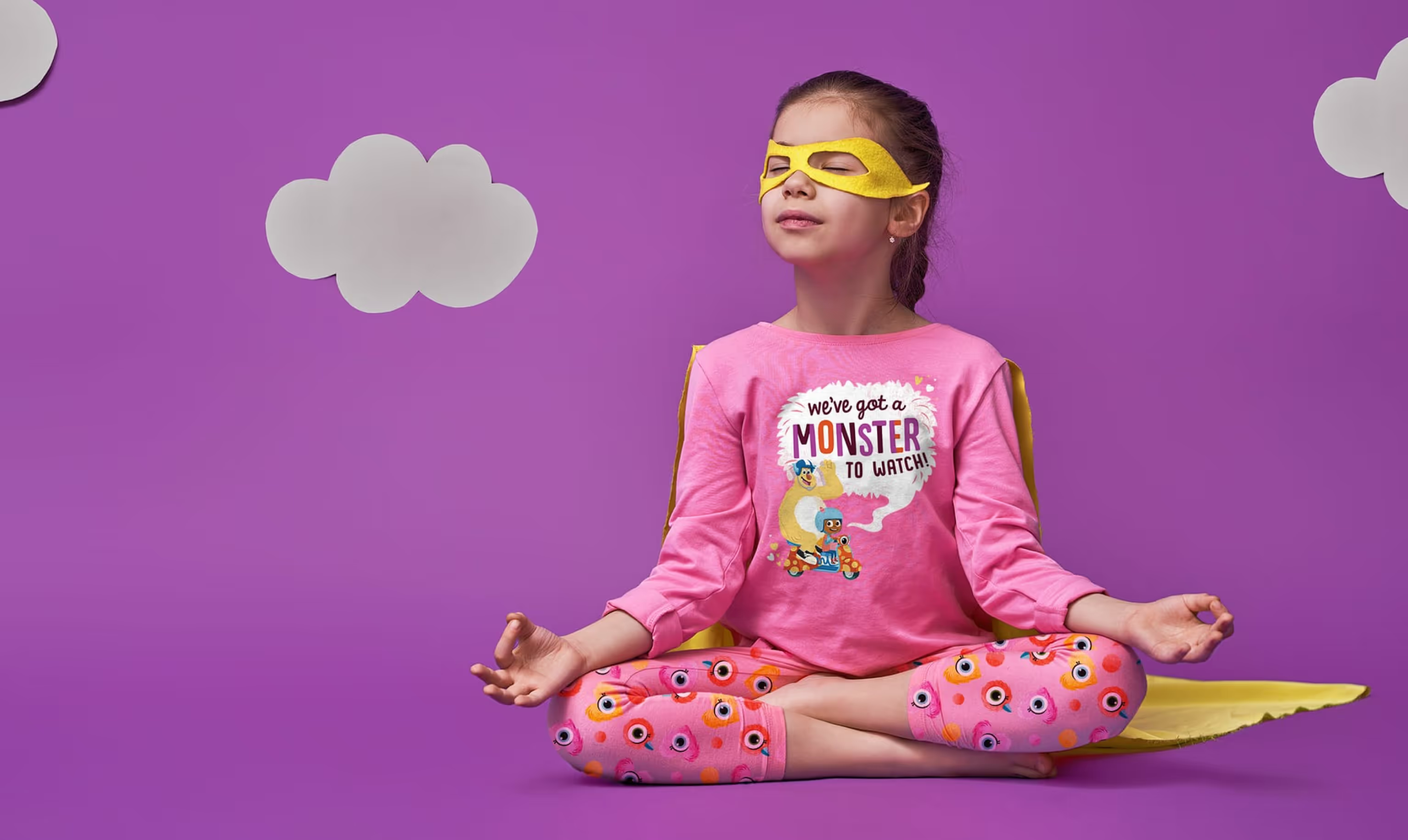
The Best Pair in Monster Care
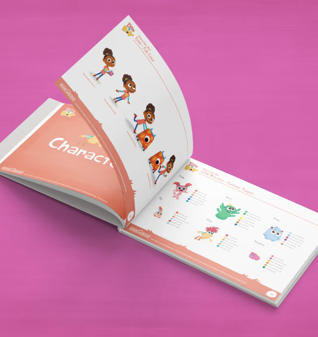
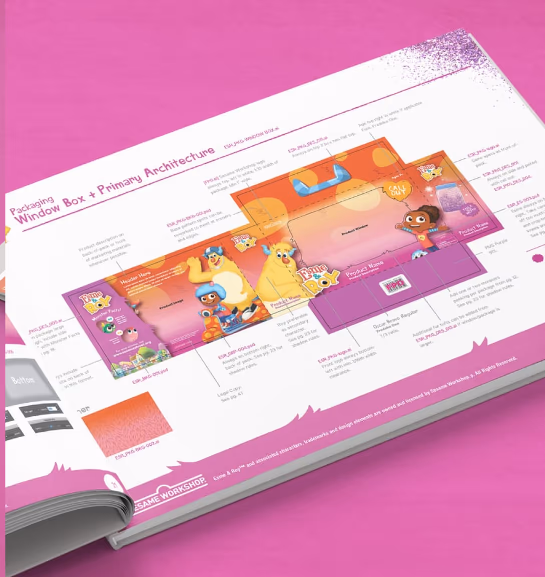
Utilizing the character design of Esme & Roy characters, we created concepts for over 18 skus that started with initial form sketches all the way through print mechanicals. Once the designs were finalizes, we created guidelines that maintained all recognizable elements cross the brand’s product packaging.
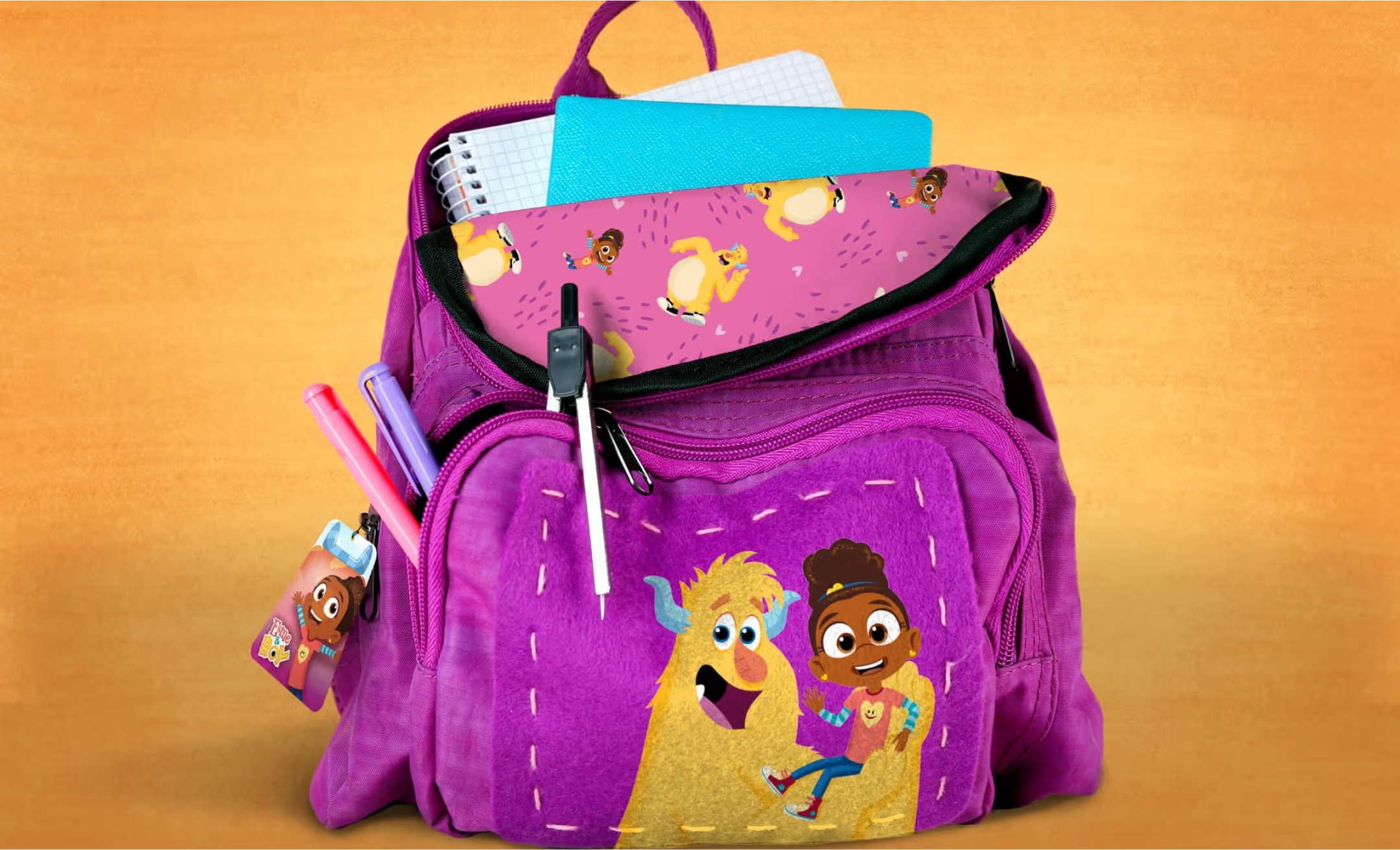
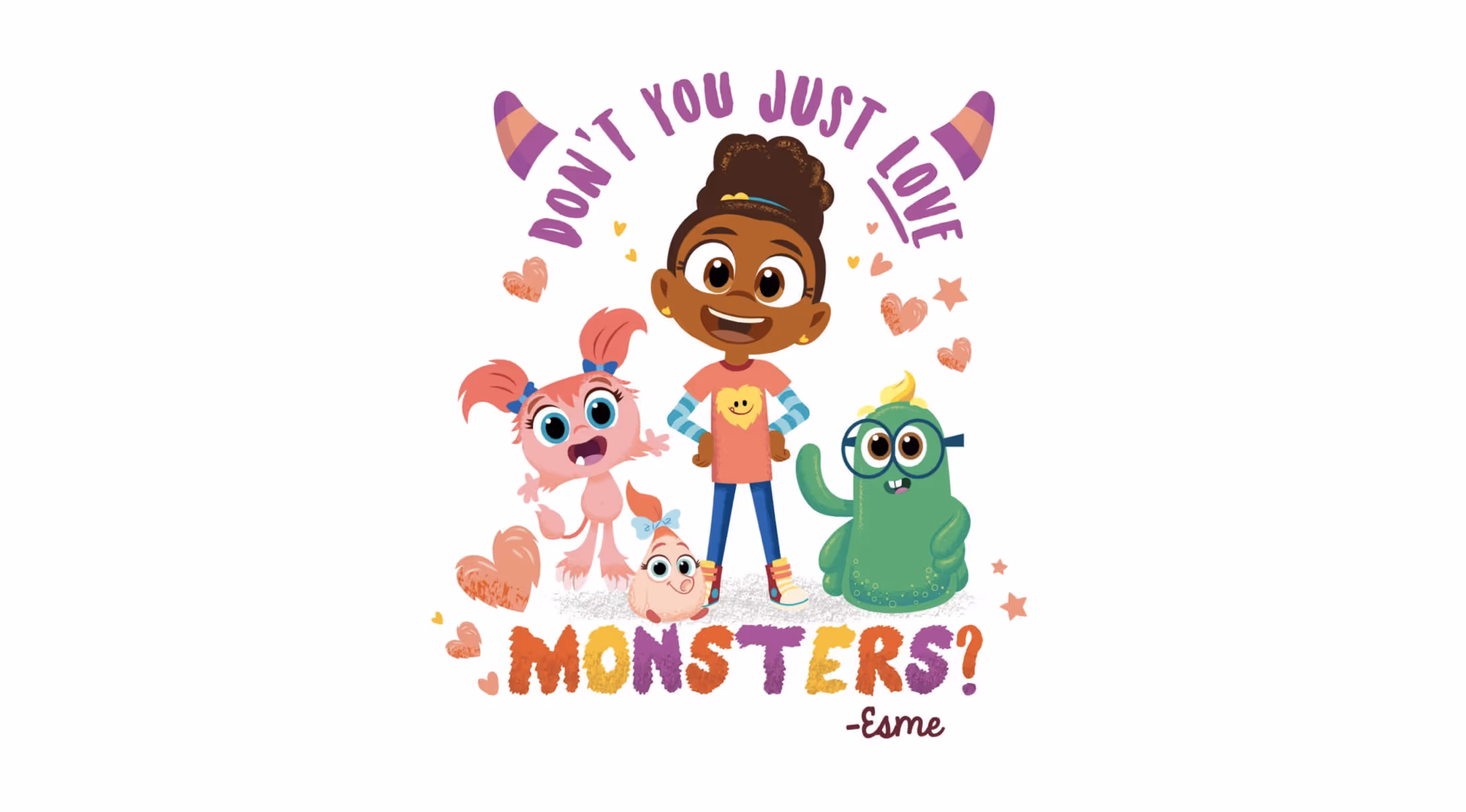
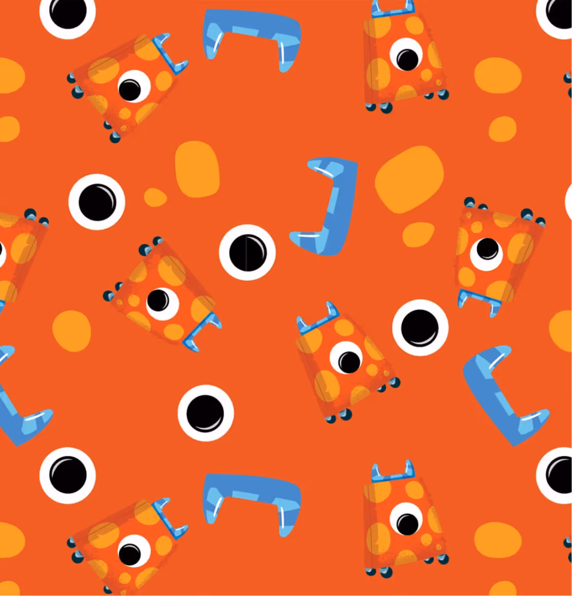
Bringing the Warm & Fuzzies
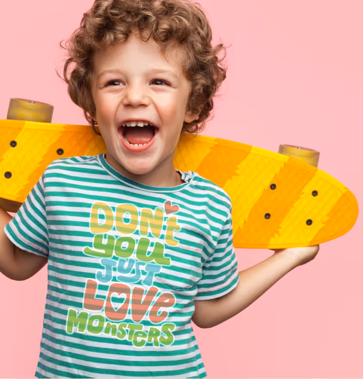
We also payed particular attention to creating graphics that were on-trend, to endear the brand to millennial moms. All of this came together in a style guide packed with patterns, icons, illustrations and graphics.

View More Work

Project Title
Project Title
Project Title
Project Title