Your Bee M.D.
Taking the sting out of a buzzing new product line for Taro Pharmaceuticals
BeeRX
The Ask
BeeRX approached us with a vision but lacking a name or brand identity. They aimed to strike a harmonious balance between scientific credibility and aesthetic appeal, targeting the discerning health and wellness consumers both in retail and online spaces. Our task was to delve deep into understanding their target audience through extensive research and surveys as a foundation for building a brand strategy, name, and brand identity that resonates with BeeRX’s consumer.
The Challenge
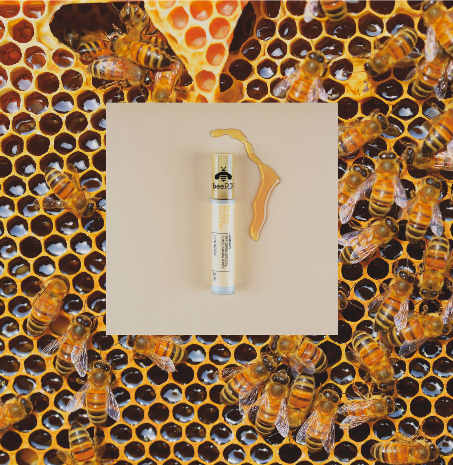
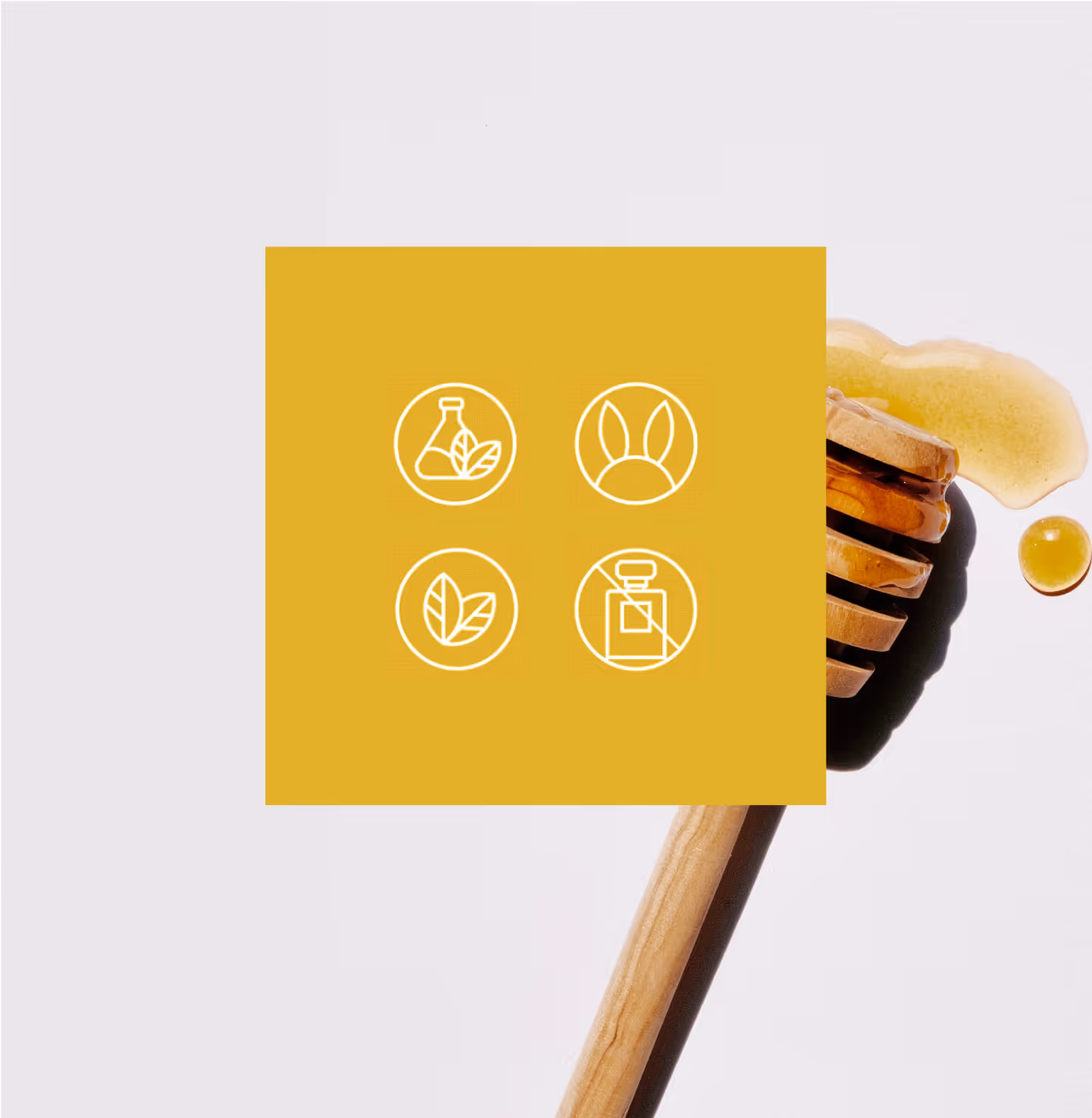
Our primary challenge was to understand consumer perceptions and develop a strategy that effectively blended the natural and clinical aspects of bee venom usage in the client’s products. Bee venom is often viewed as unappealing, dangerous, and lacking positive effects. We needed to convey the safety, efficacy, and natural properties of bee-venom derived ingredients while instilling authenticity and trustworthiness. Extensive research revealed the necessity of positioning the product within the beauty category alongside addressing other communication requirements. An extensive task that we rose to the challenge of.
The Solution
We developed a comprehensive brand strategy for BeeRX, emphasizing its core values of efficiency and science. Leveraging the backing of Dr. Sean Holt, a certified medical expert, we were able to position Bee RX in such a way that customers new it utilized bee-derived ingredients to create safe and effective products. Secondary messaging backed up the health benefits with more relatable and emotional claims such as "naturally derived" and "ethically sourced" making this a brand consumers could really believe in. Finally the Brand Identity took on a softer, more approachable tone that leveraged a clinical beauty and glimmer that helped the product itself shine on shelf.
Bee the Change
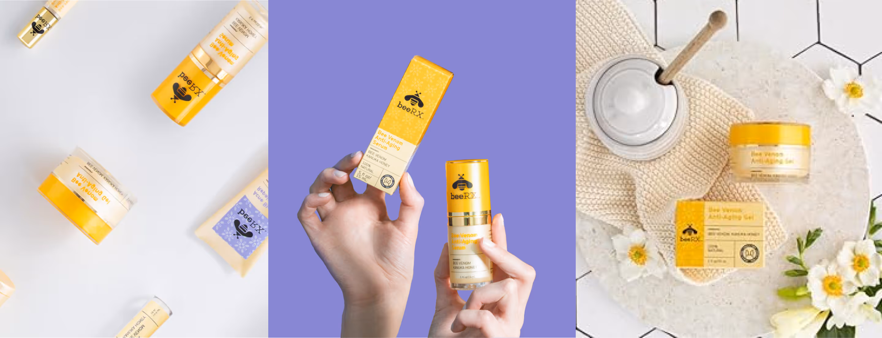
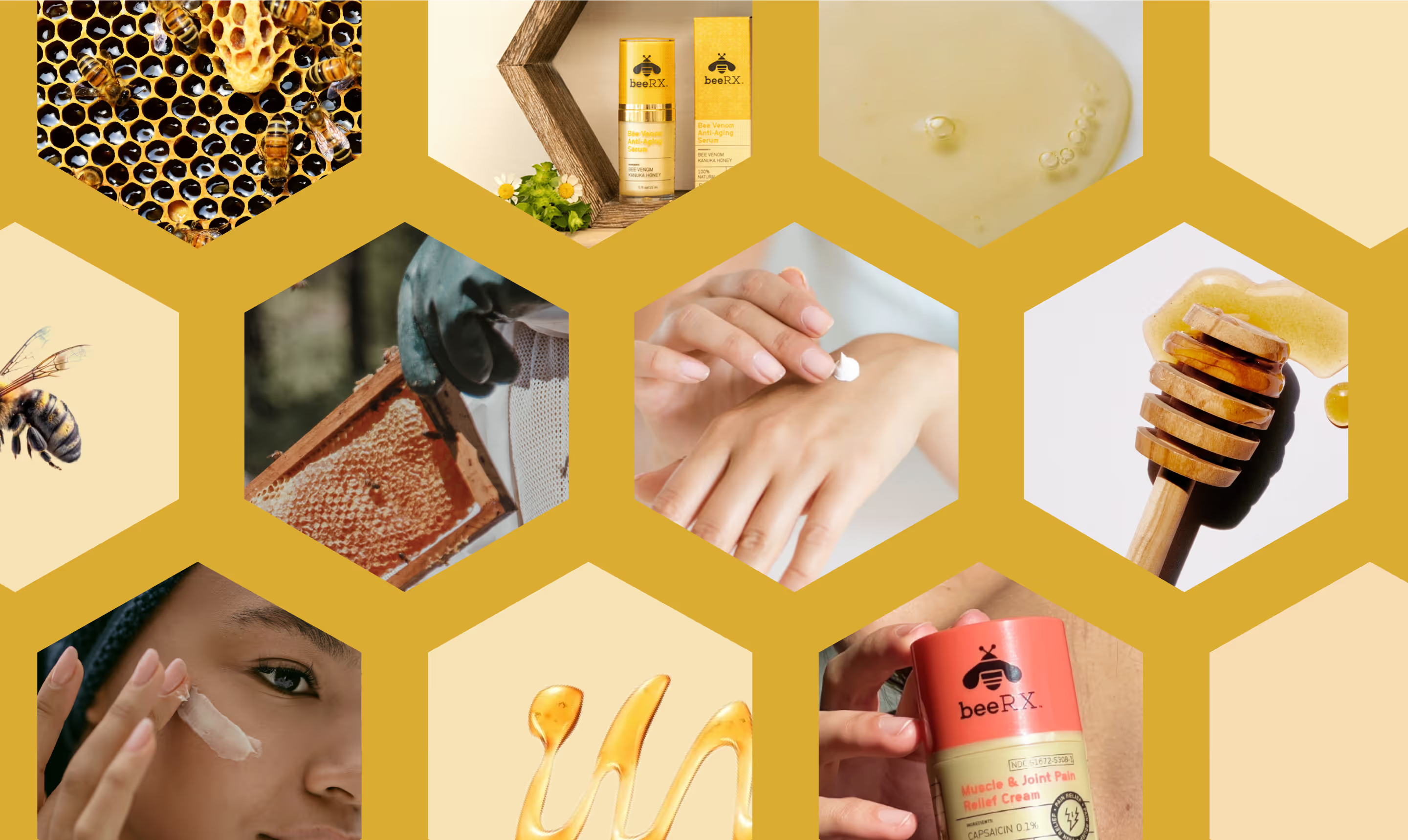
Our focus shifted to expanding BeeRX's brand strategy verbally and visually. We created impactful headlines like "The natural healing power of the honeybee." and "Evolution’s solution to health and wellness," capturing their brand essence. We also crafted a visual identity blending science and nature, conveying credibility and positioning BeeRX as a leader in natural, scientifically-backed health solutions.
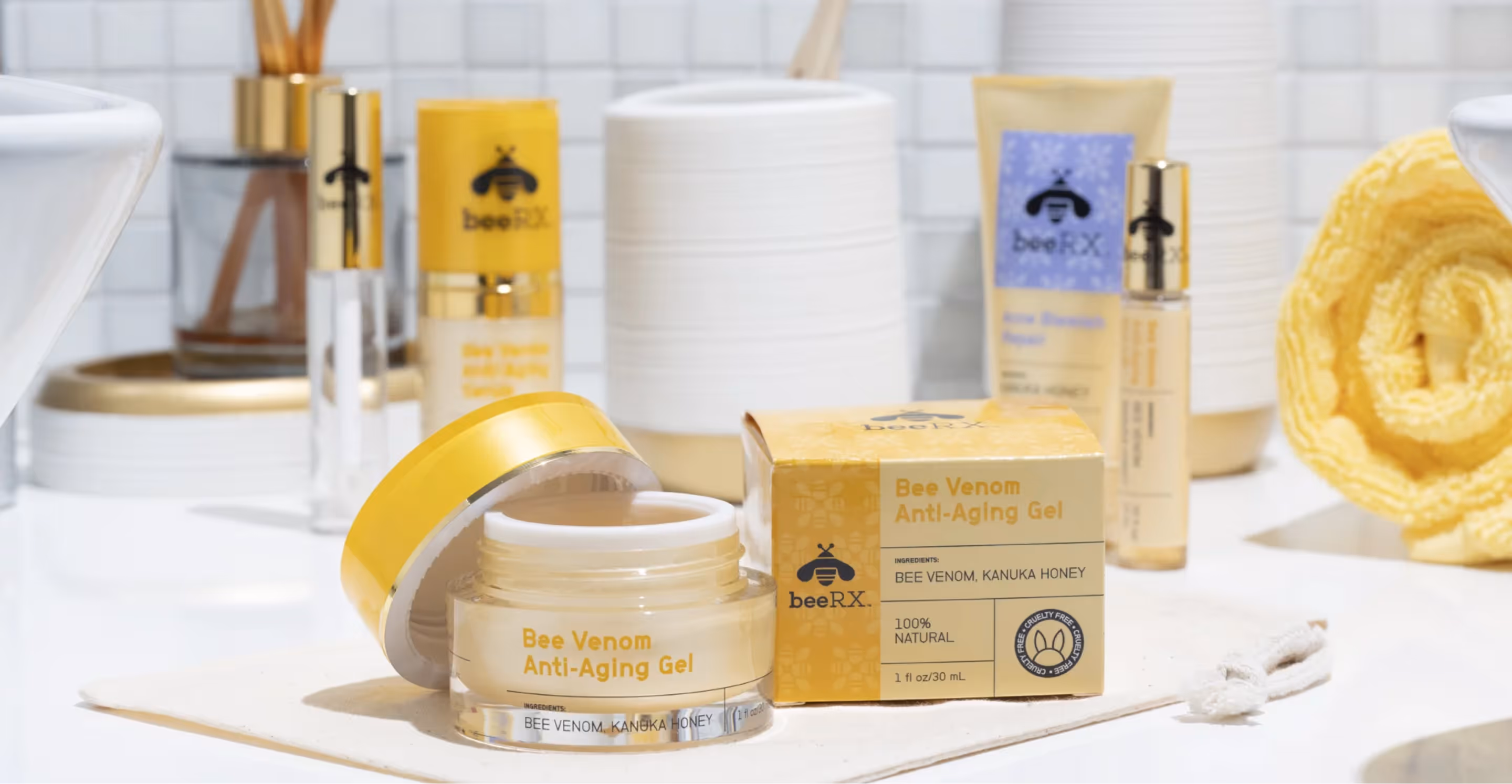
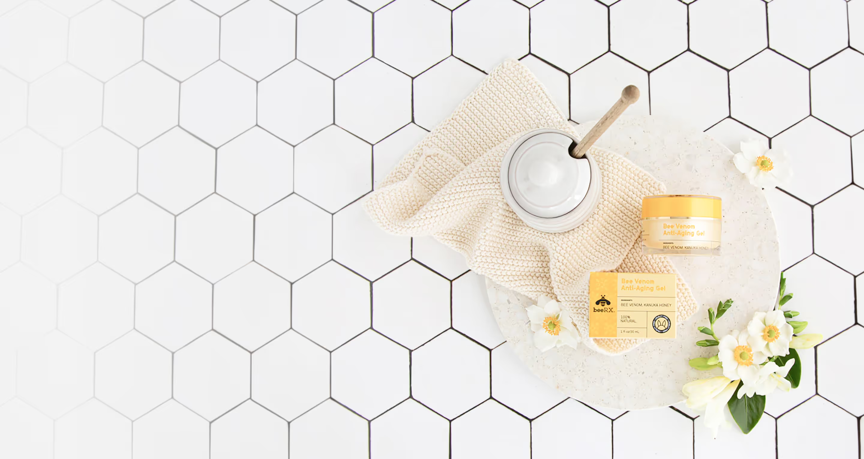
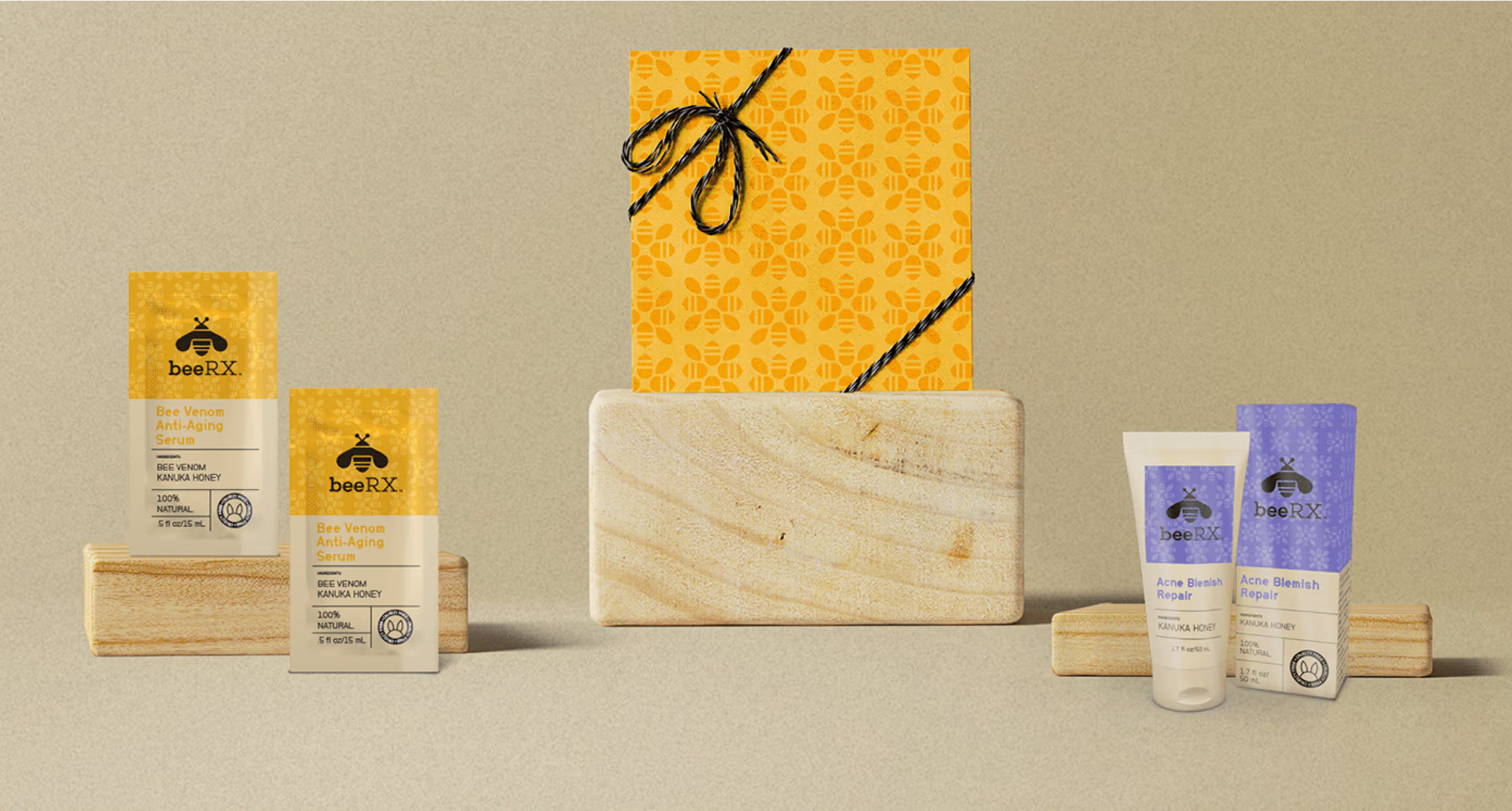
Sting does it’s thing
Our packaging design aimed to captivate consumers with vibrant and elegant colors, reflecting the natural vibrancy of bee habitats. We established a unique hierarchy and typography system to ensure clarity and consistency across all products. Adaptable patterns were introduced, accommodating various product dimensions while maintaining brand coherence.
View More Work

Project Title
Project Title
Project Title
Project Title